Project Scope
Role: Creative Direction, Design Systems & Infographics
Key Deliverables: Social Media Assets
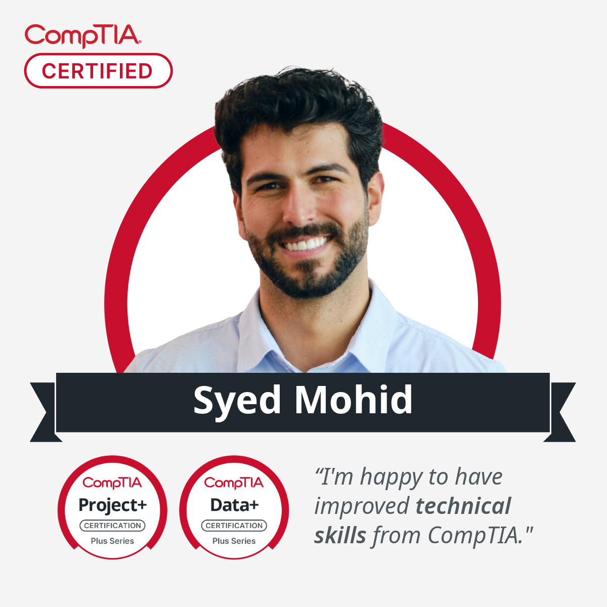
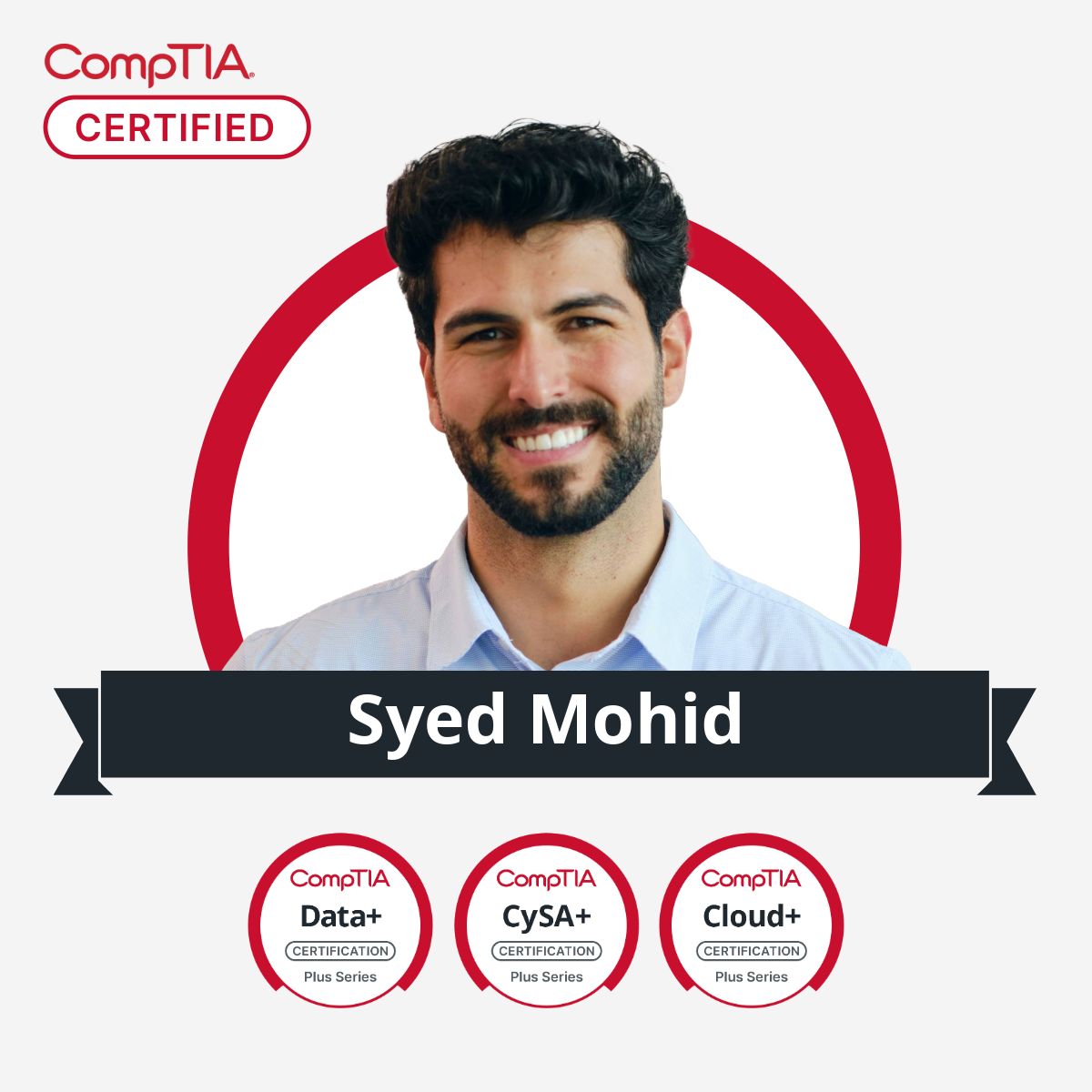
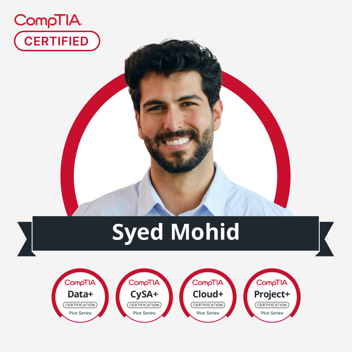
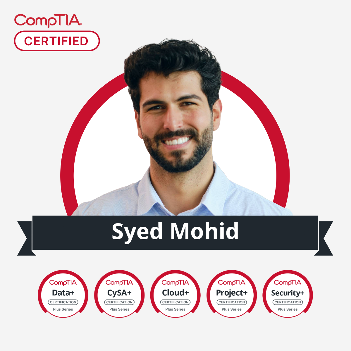
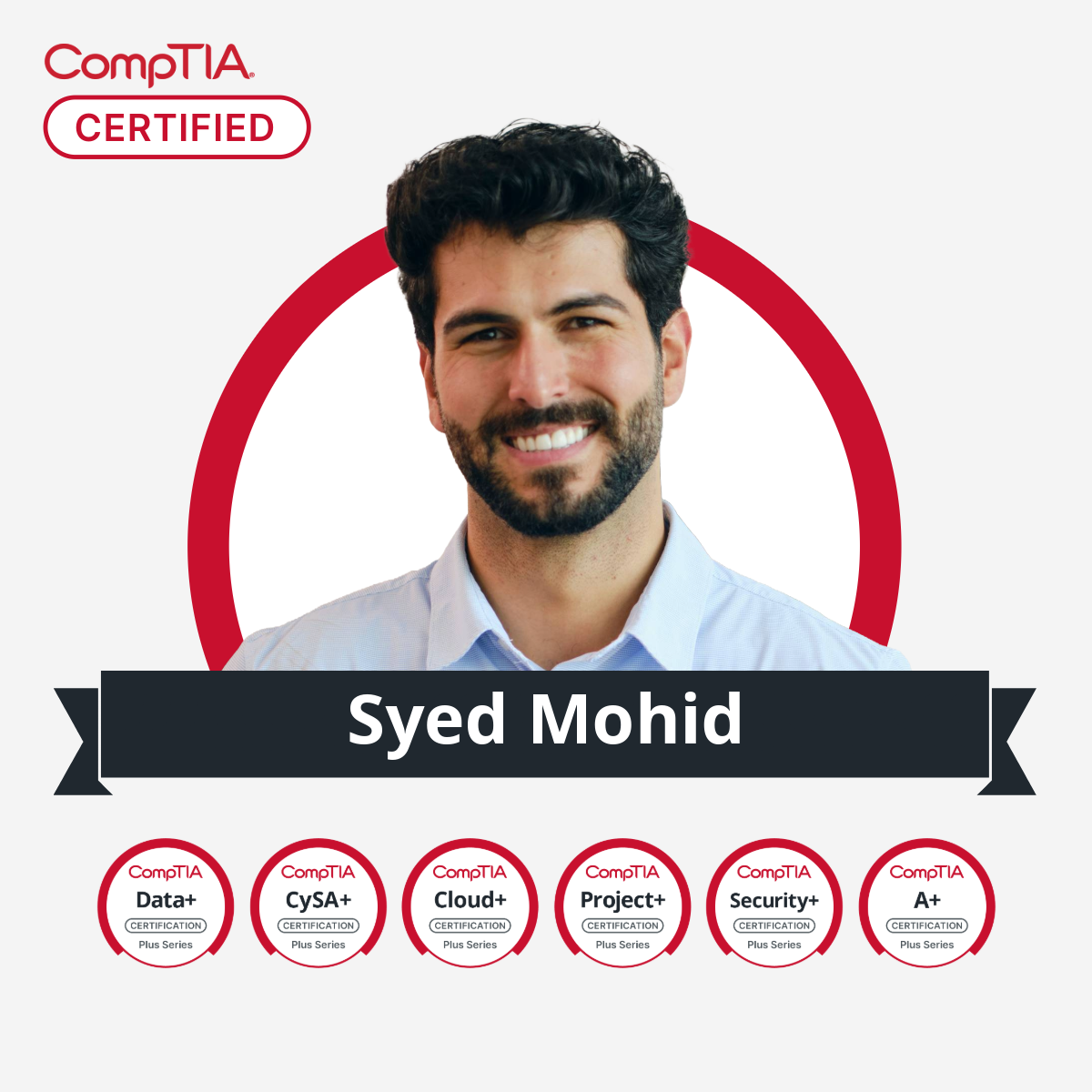
Spotlight Sunday
Before & After
My goal was to transform a standard corporate testimonial into a coveted "badge of honor." I wanted to humanize the certification achievement by shifting the visual hierarchy to feature the professional front and center. The design uses the brand's signature red circle not just as a border, but as a unifying halo, creating a visual loop that guides the eye naturally from the key credential to the person and finally to their story.
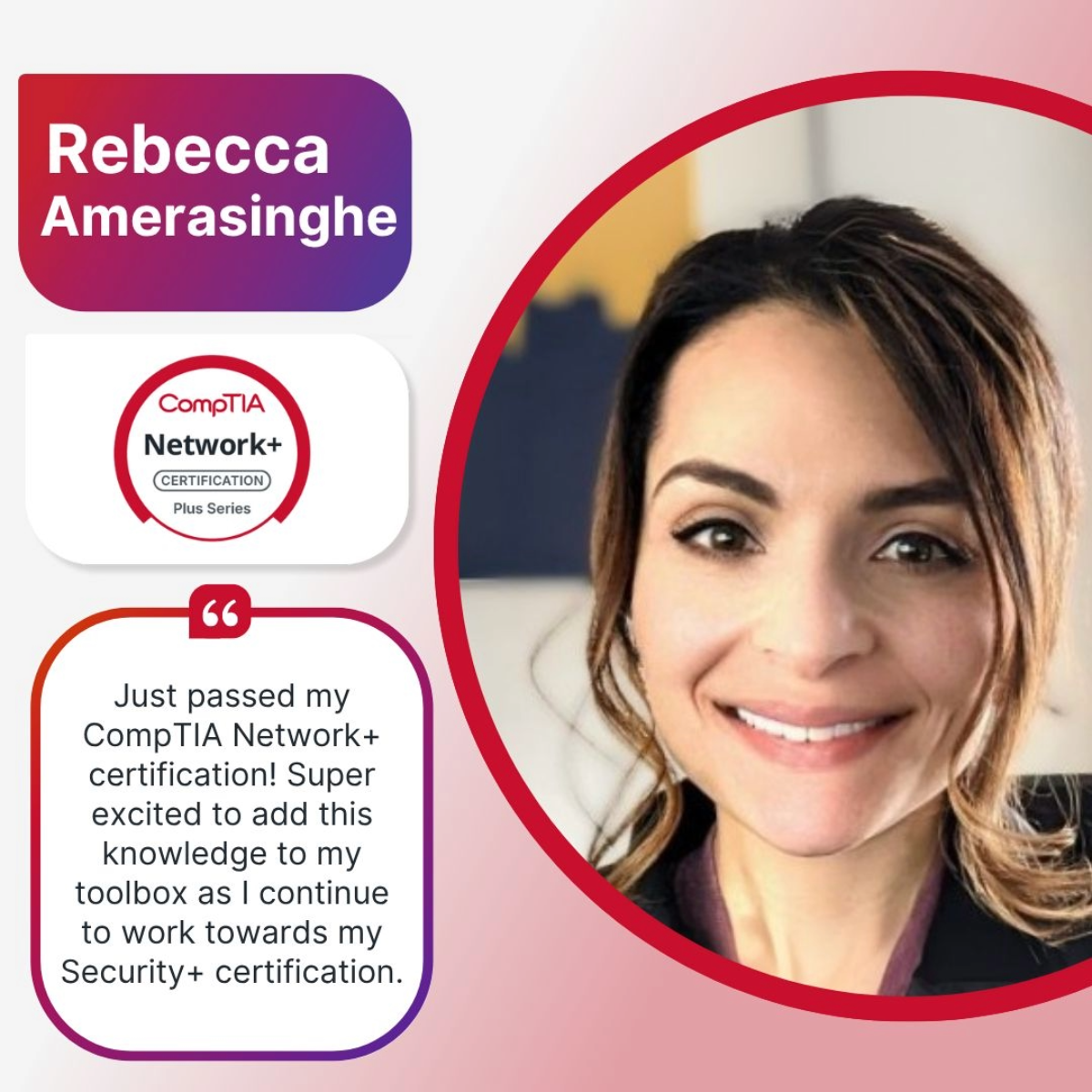

Design Solution: I created a flexible "Arch Frame" layout to solve a critical production bottleneck: inconsistent user-generated photography. The central arch acts as a universal mask, looking equally polished in high-end studio cutouts as in standard photos with complex backgrounds. This eliminated the need for time-consuming background removal, enabling the social team to scale production rapidly while maintaining a premium, cohesive look.


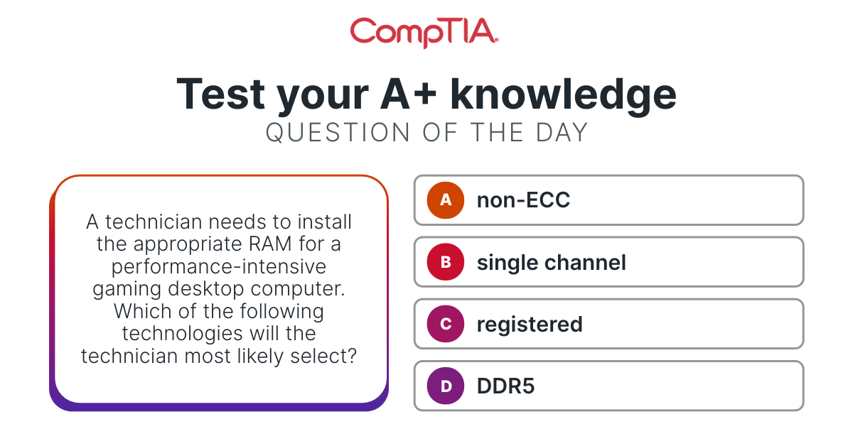
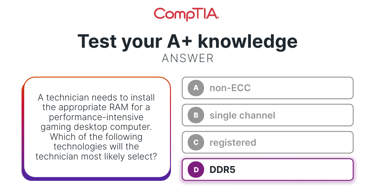
Question of the Day
High Visual Noise (Before)
For the Question of the Day series, I pivoted the design direction from a graphic-heavy layout to a functional, user-centric interface. The previous iteration relied on heavy background gradients that often competed with the text.

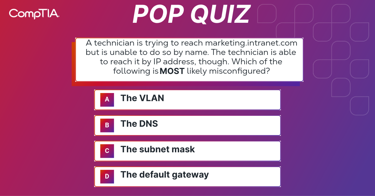
Content-First Focus (After)
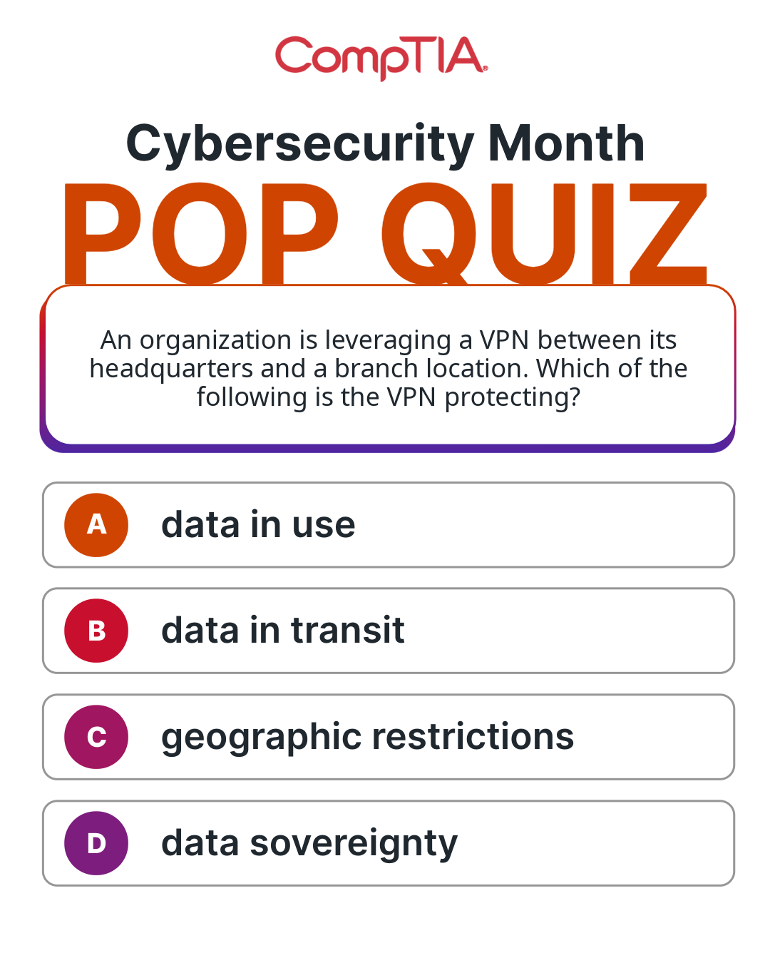
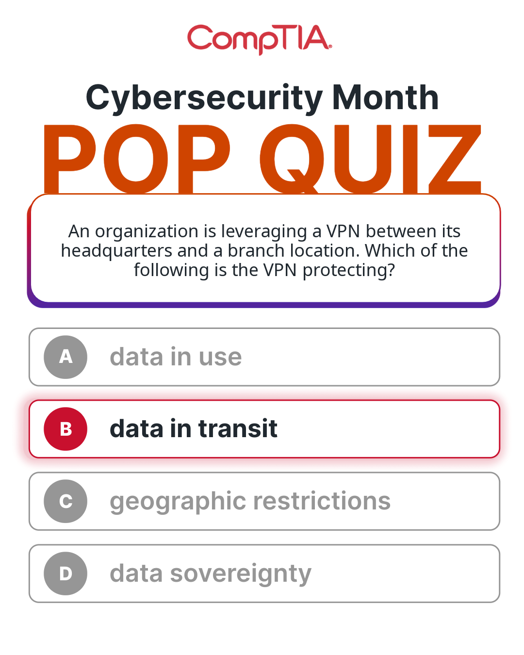
Shifted from passive content to active participation using gamified 'Pop Quiz' layouts. These templates were optimized for tap-through engagement on Instagram Stories, boosting user retention and time on page.


Editoral Design
This design solves the challenge of a text-heavy format by treating typography as the primary visual element. I stripped away unnecessary decorative graphics to focus on readability and hierarchy. The design channels a 'digital newspaper' aesthetic through high-contrast font pairings and generous negative space, making the information density feel approachable and scannable. The result is a digest that respects the reader's time.


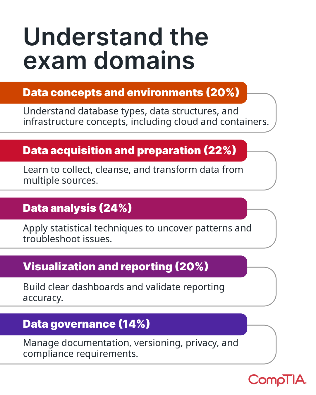
From Static to Sequential: Infographics Redesign
Information Overload in Heavy Visuals (Before)
By combining complex line graphs, detailed data lists, citations, and branding into a single frame, the design forced users to "work" to extract the key message. On mobile devices, this density often required zooming in, breaking the seamless scroll experience.
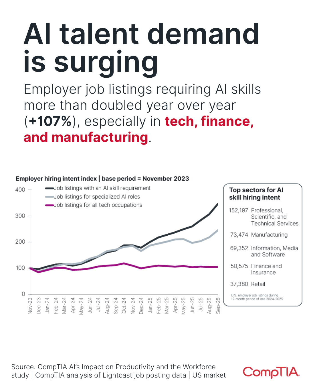
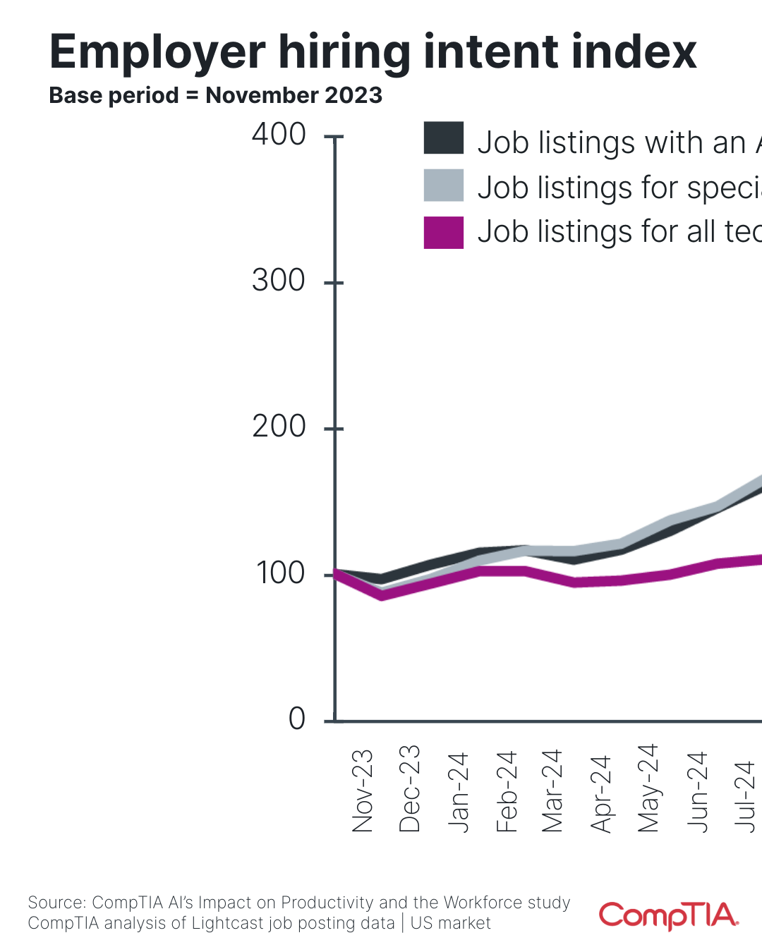
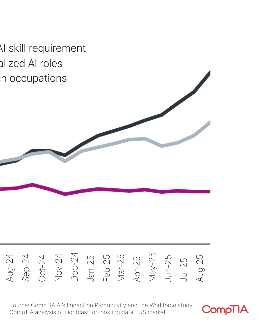
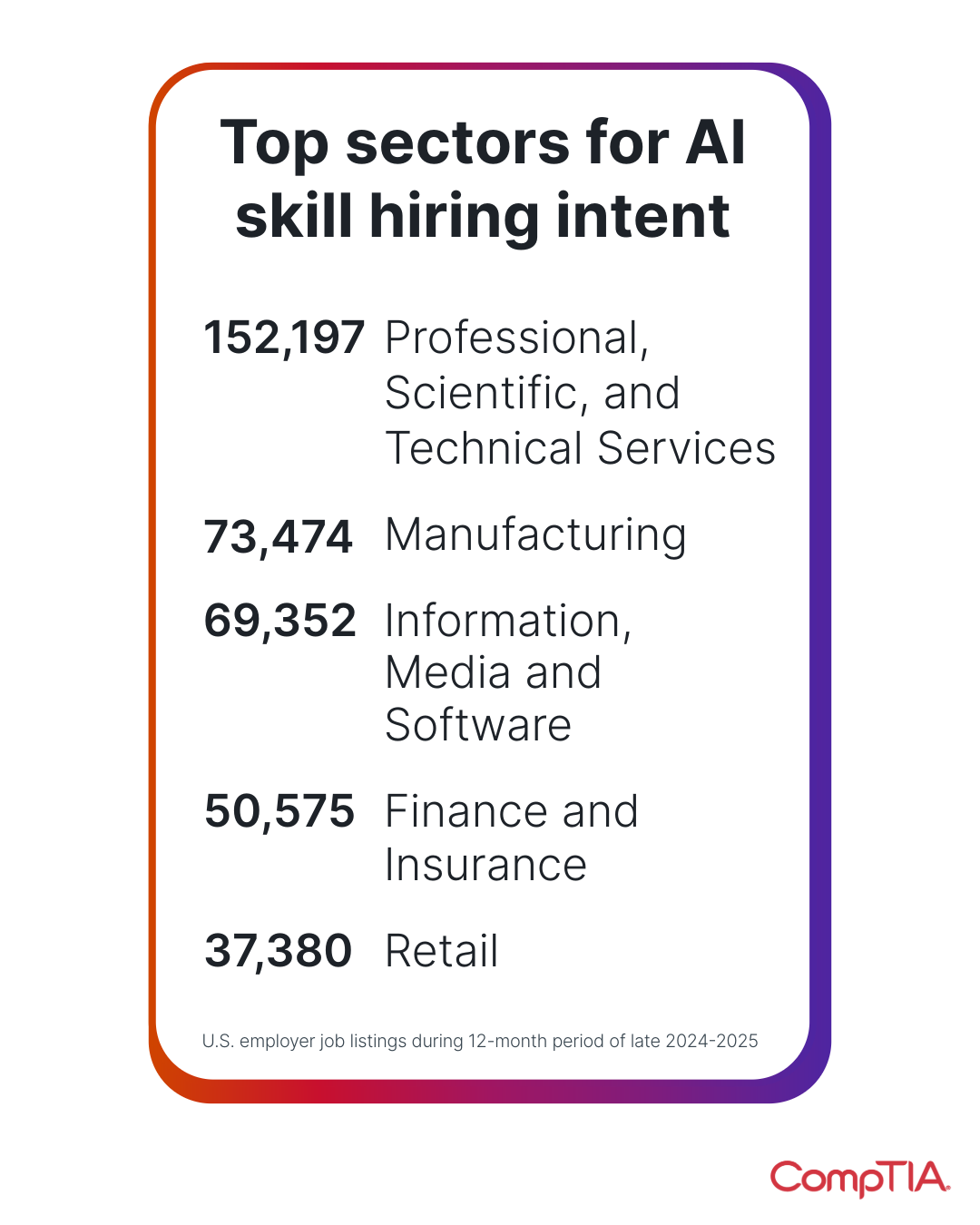
The Redesign Strategy: Expanded Carousel Redesign (After)
Deconstruction: I broke down dense, single-frame infographics into multi-slide carousels, transforming data dumps into guided narratives.
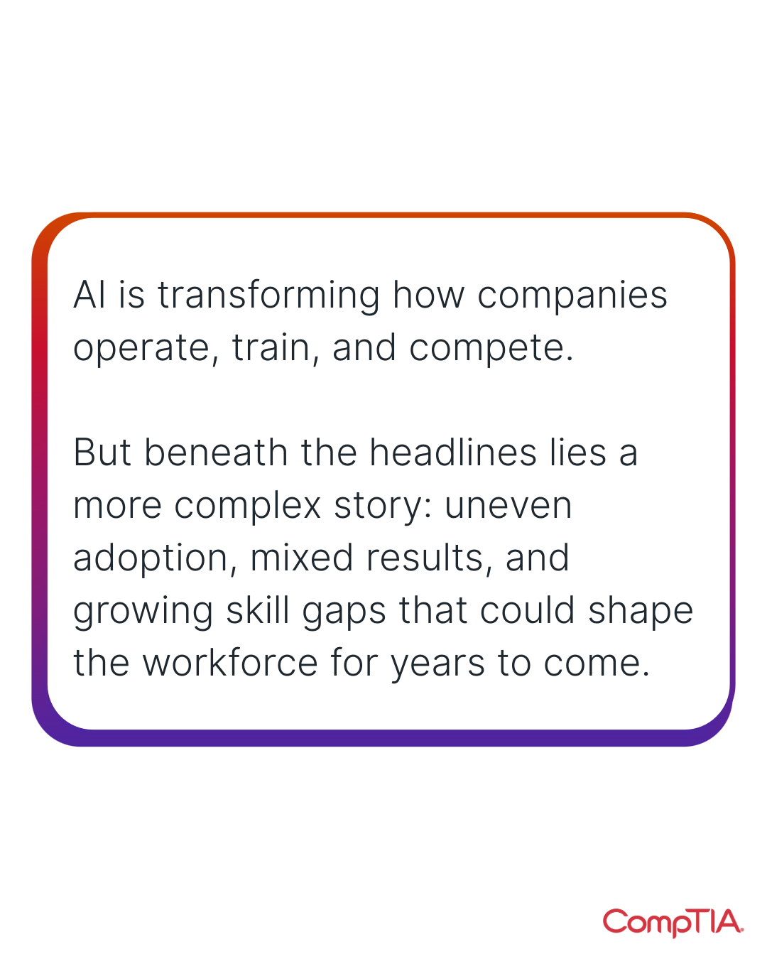
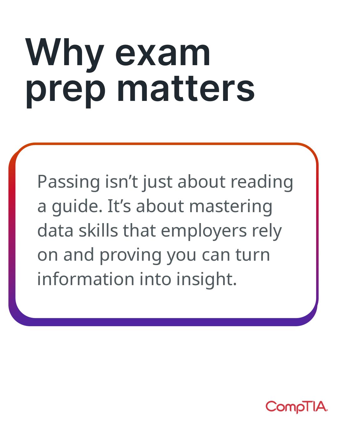
Pacing: The flow is engineered for engagement, starting with a high-impact typographic hook (using the brand gradient) before transitioning to detailed data.
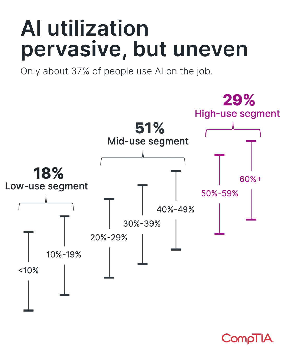
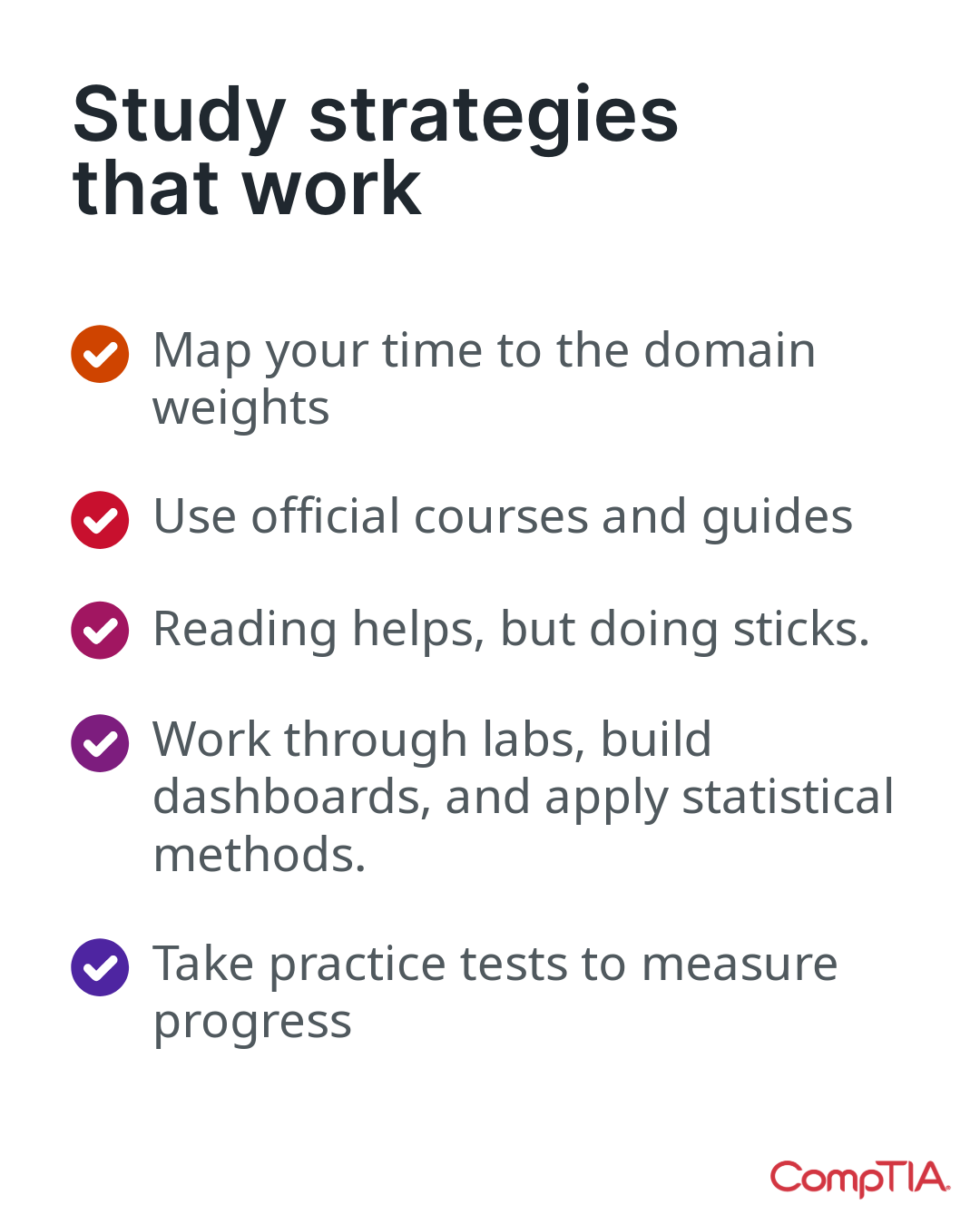
Isolation: Hero stats and complex charts are given dedicated slides with ample negative space, significantly reducing cognitive load on mobile.
Visual Clarity: I shifted from heavy background decoration to a clean, content-first aesthetic, ensuring data points are the loudest element in the hierarchy.


Resolution
This redesign successfully transformed dense, single-frame infographics into engaging social carousels. By breaking complex visuals into a sequential narrative, I improved data readability, reduced cognitive load on mobile devices, and created a more shareable asset that guides users through the story, one swipe at a time.
Carousel Template System
Built a robust library of plug-and-play assets for the internal social media team. These templates reduced design turnaround time by 40%, allowing non-designers to publish on-brand content independently.