Project Scope
Role: Product Logo Design System
Key Deliverables: Product Logos that communicate progression and are scalable
Challenge
As CompTIA's portfolio of certifications grew to lead the industry, there was a strategic opportunity to evolve the certification logos. The goal was to create a next-generation system that enhances brand cohesion, clearly differentiates product series, and streamlines deployment for our partners. A key part of this evolution was ensuring the new designs would be a model of accessibility, fully meeting WCAG standards to serve every part of our community.
Logos Lack Differentiation
CompTIA certification logos lack differentiation, making it difficult to identify their specific levels or series. This creates challenges for both internal teams and external audiences.
Designing a custom icon for each certification is inefficient, delaying rollouts and increasing costs. A more systematic logo design is needed to communicate certification progression.

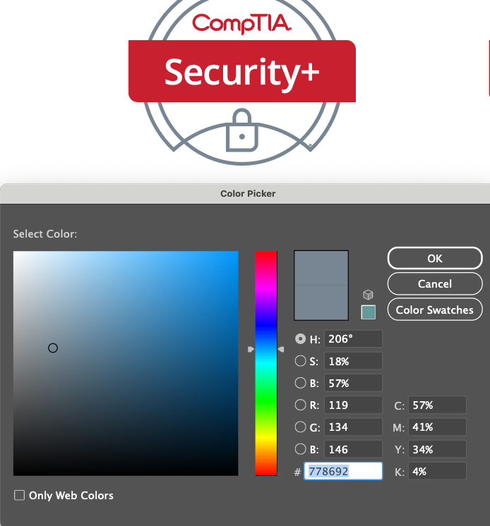
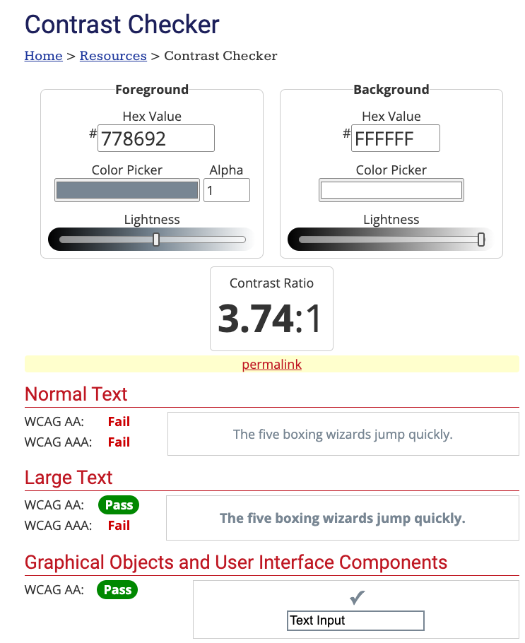
Failed WCAG Compliance
Vision
A comprehensive rebrand centered on the certification logos. The objective was to strategically realign the visual identity with CompTIA's evolving brand and engineer a cohesive, accessible, and scalable system that clearly communicated certification progression.
Solution
To preserve the core equity of the original logo shape while infusing it with a modern, a systematic approach focused on:
• Strategic Color Palette
• Accessibility & Clarity
• Systematic Flexibility
Strategic Color Palette
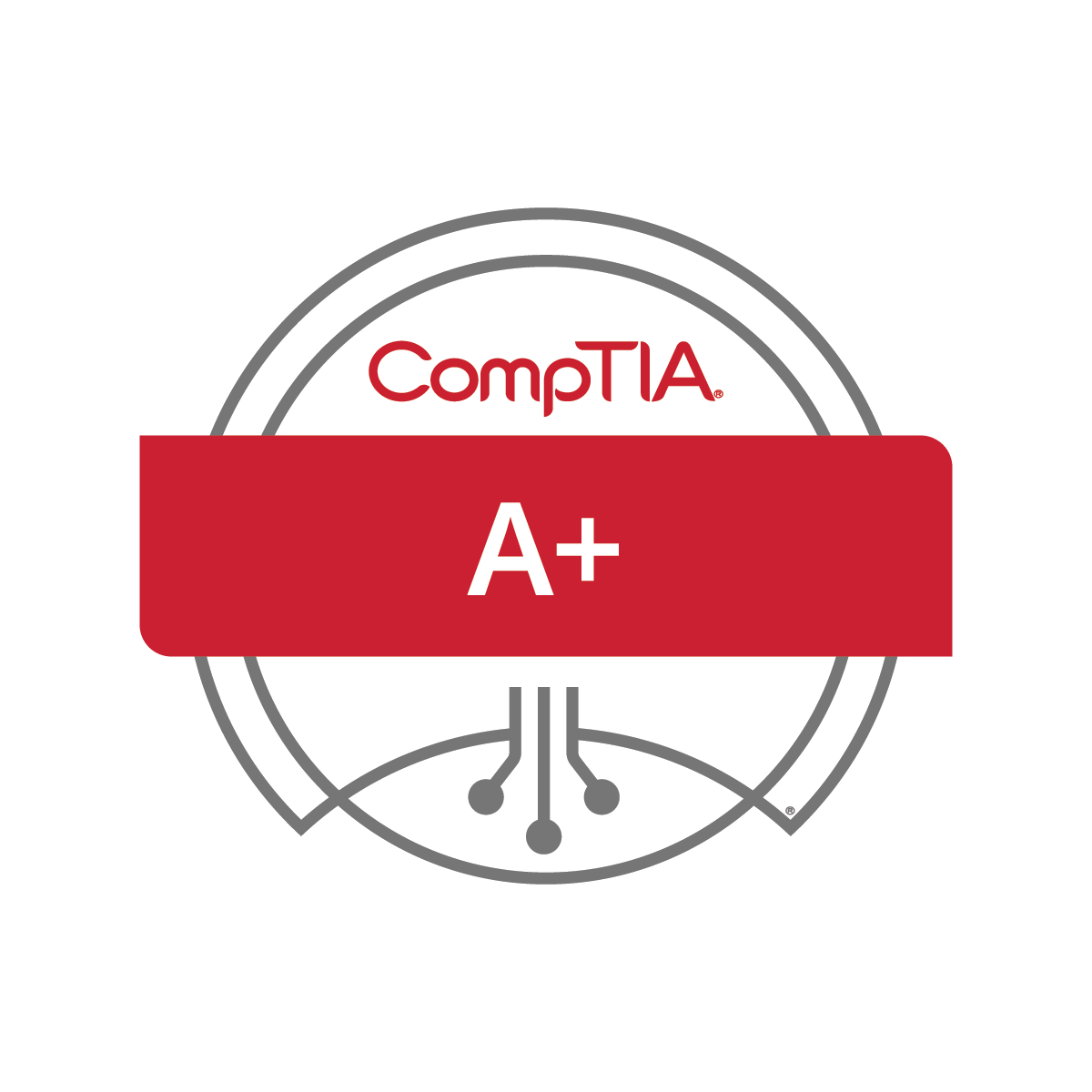
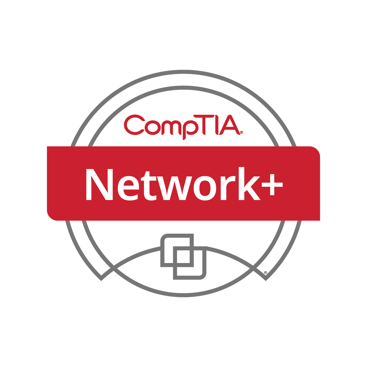
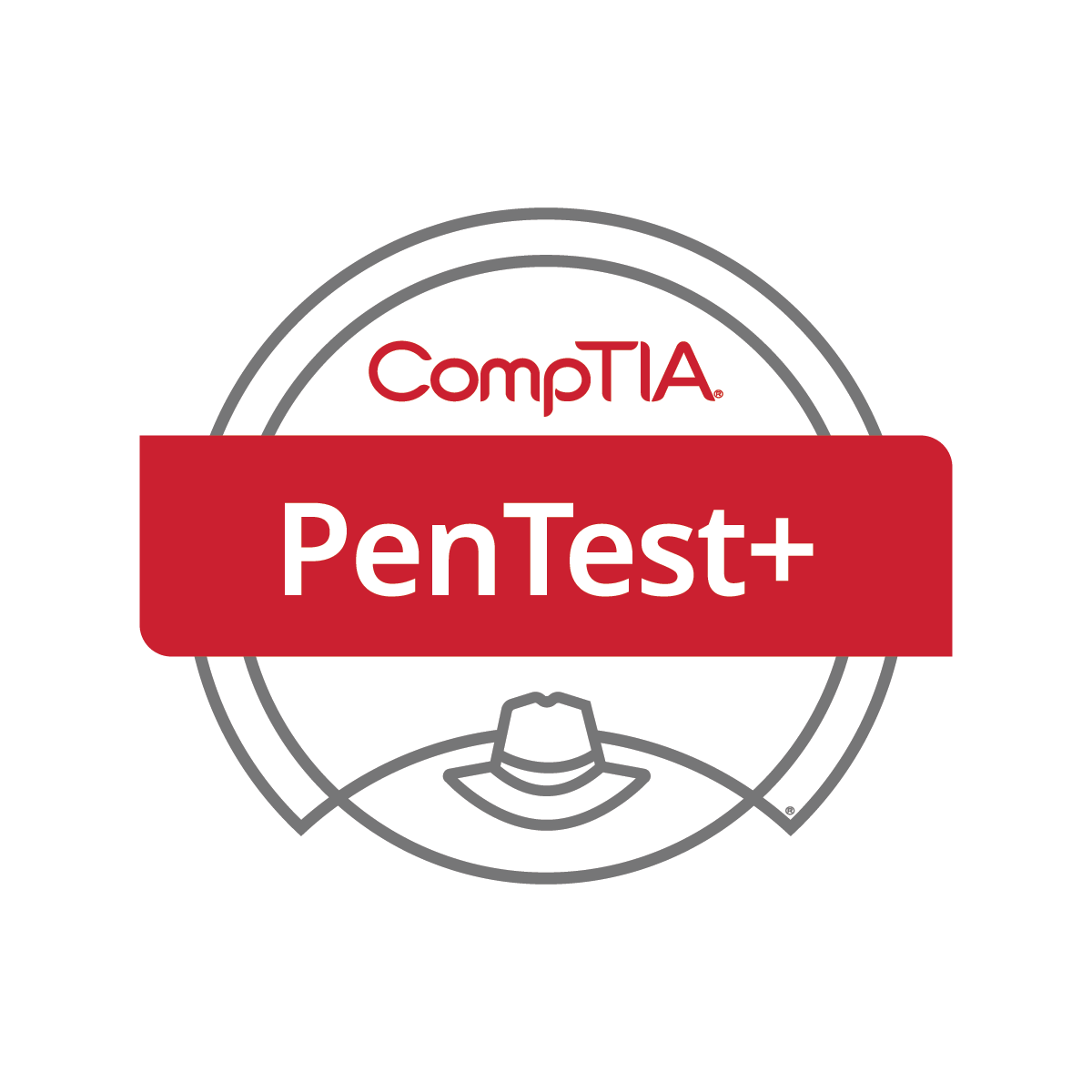
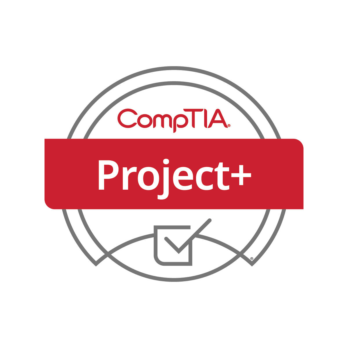
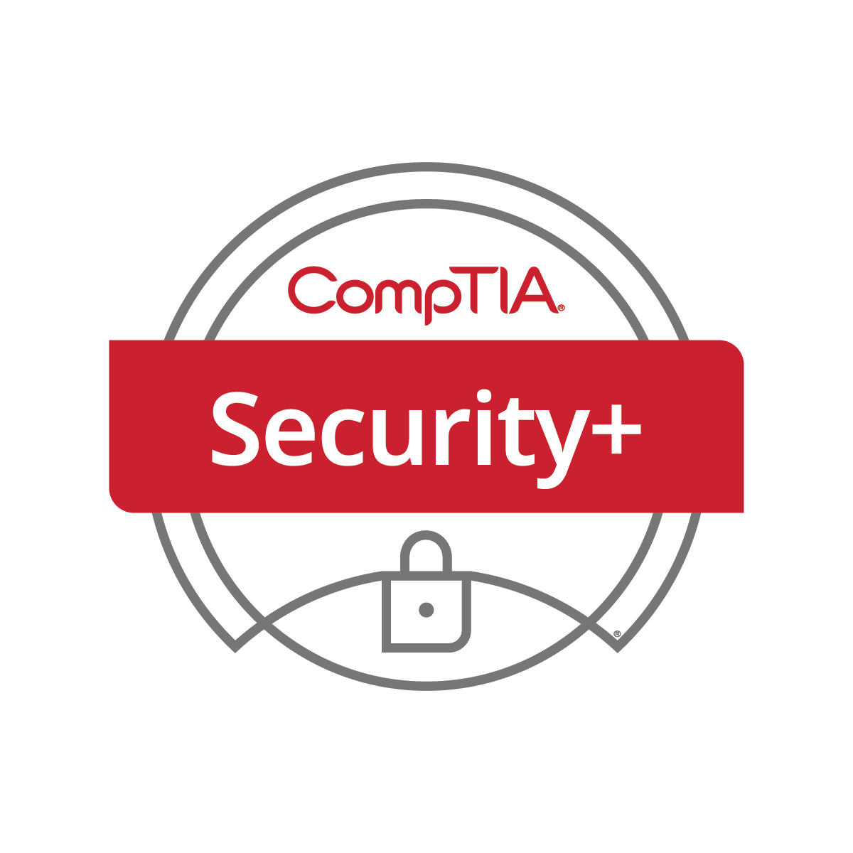
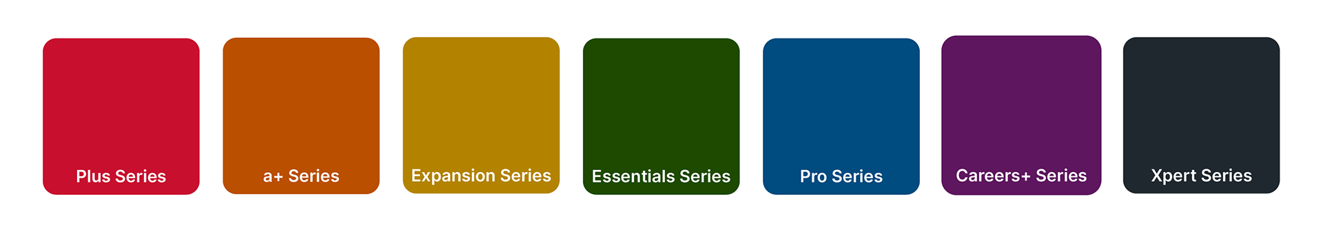
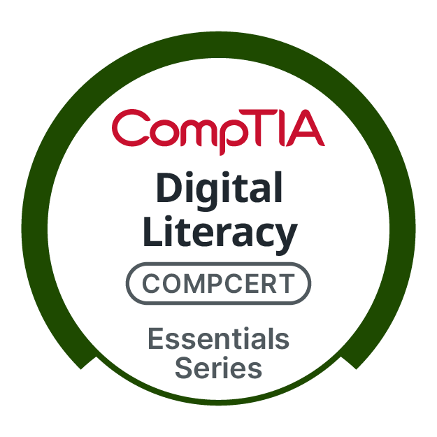
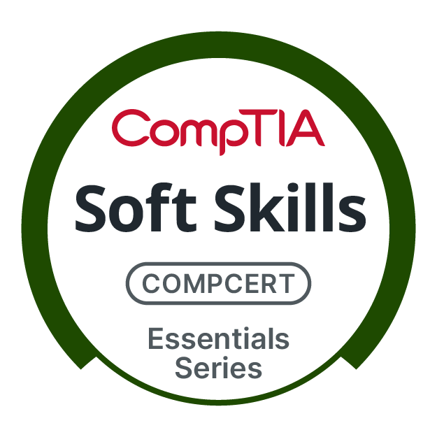
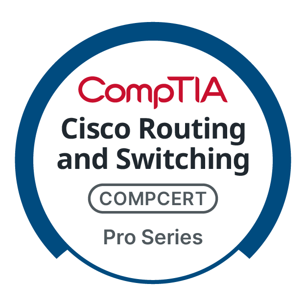
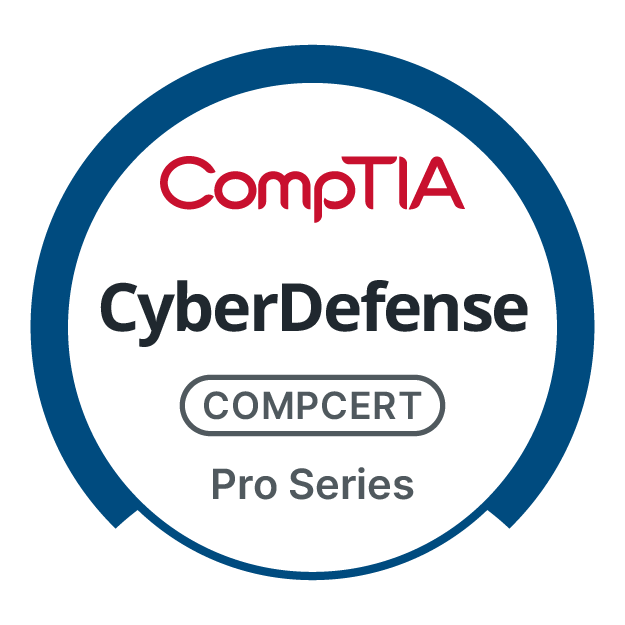
Segmented certifications into seven distinct series, each assigned a unique color reflecting its specific value proposition from foundational (Essentials - Green) to expert (Xpert - Black). This immediately solved the differentiation problem.
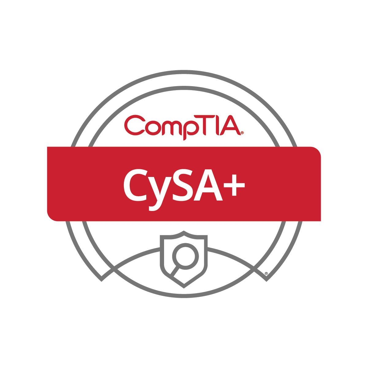
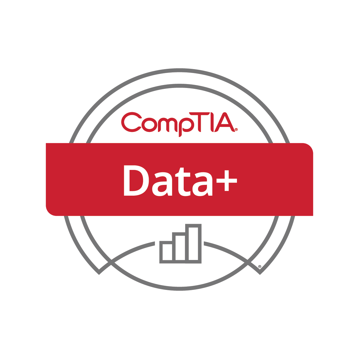
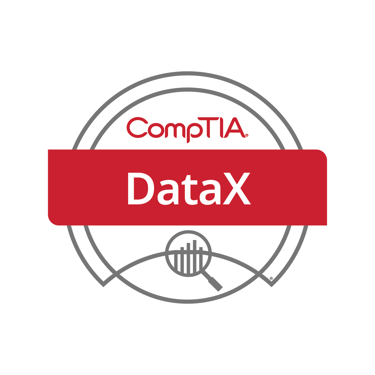
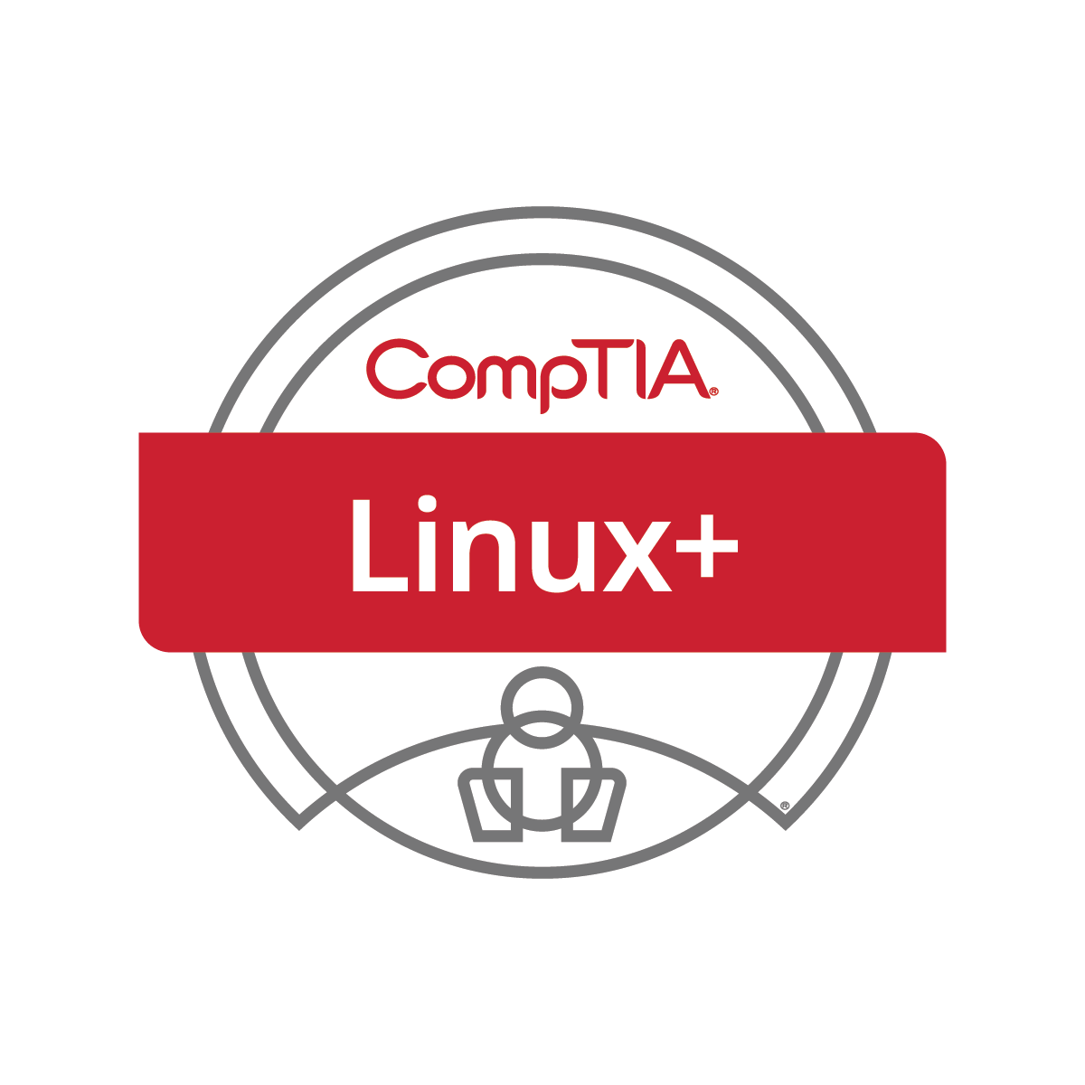
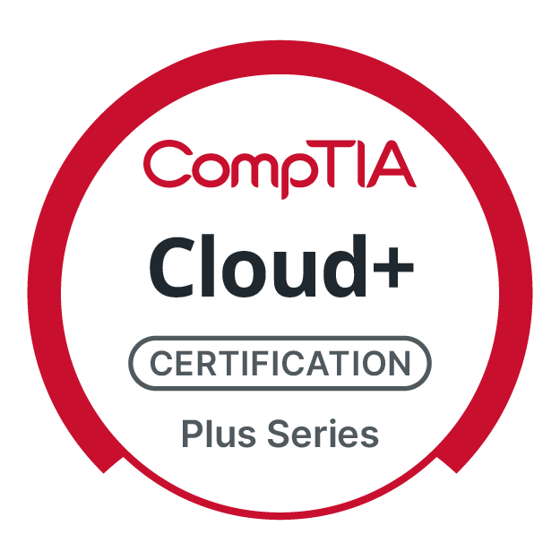
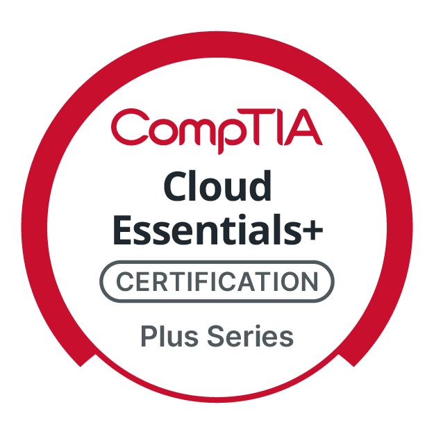
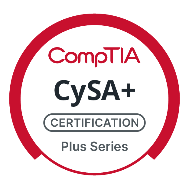
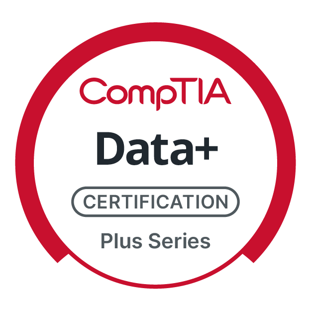
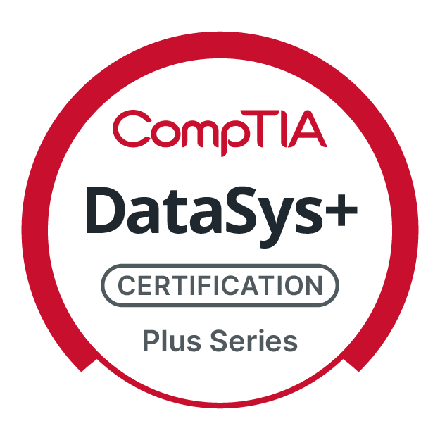
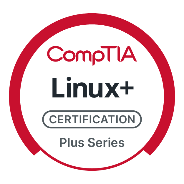
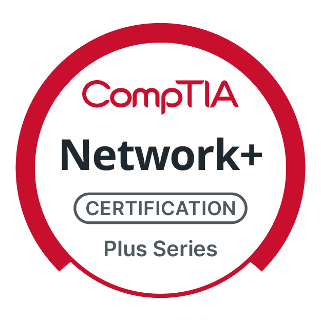
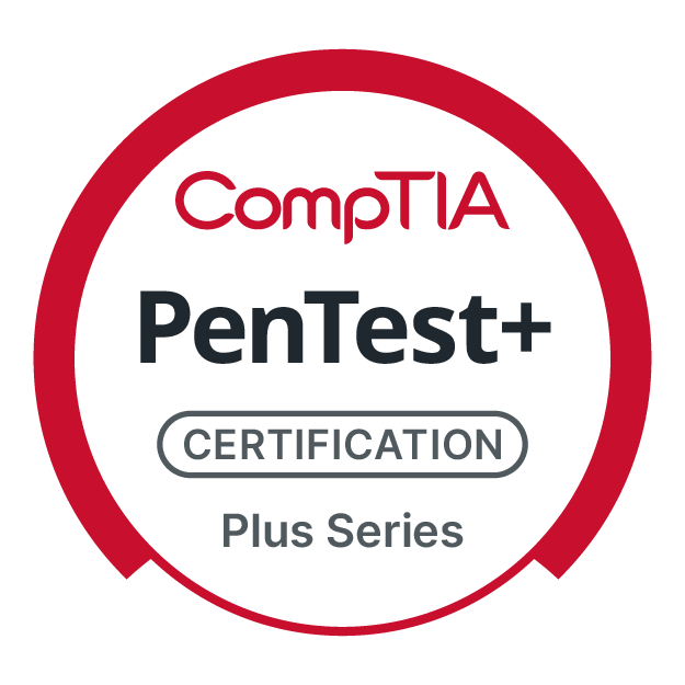
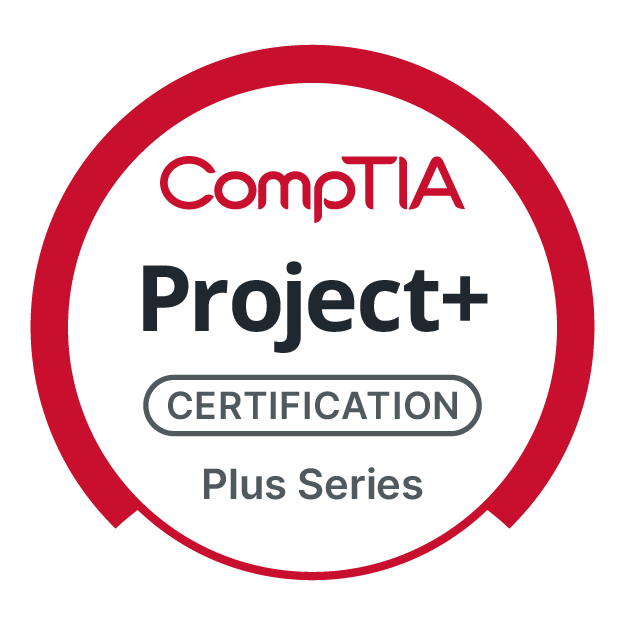
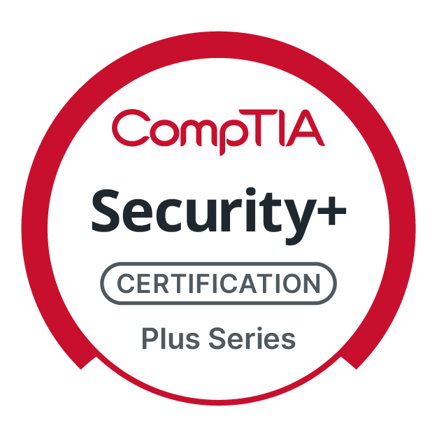
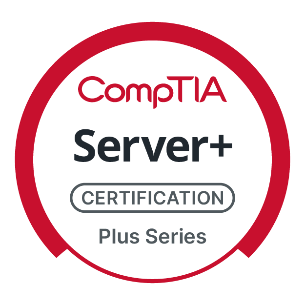
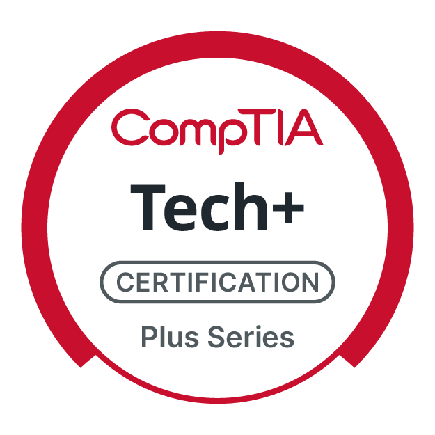
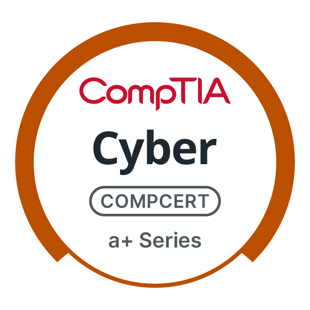
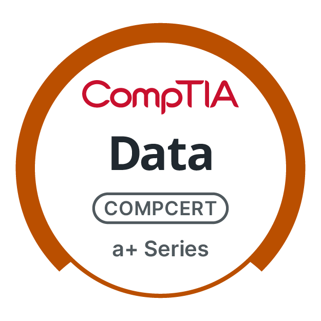
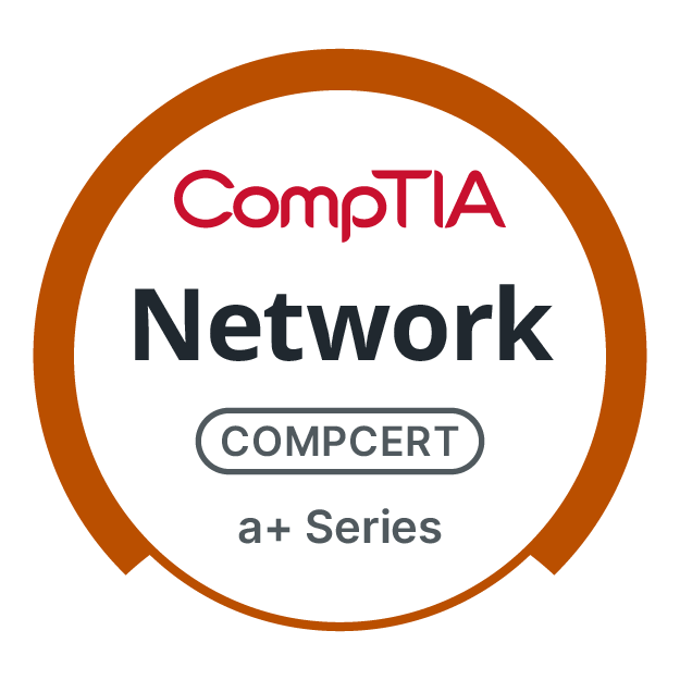
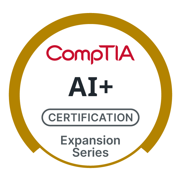
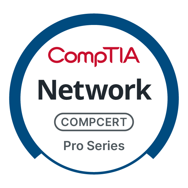
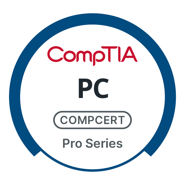
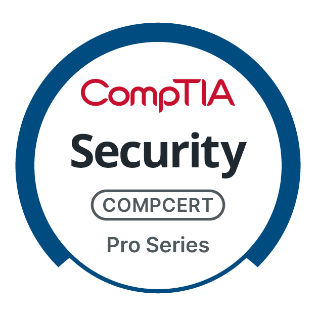
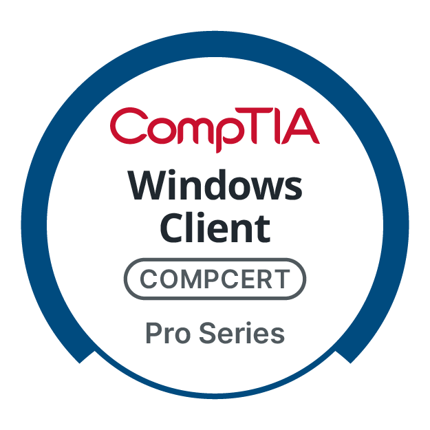
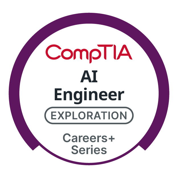
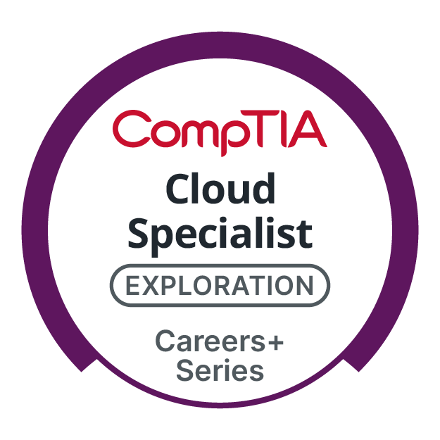
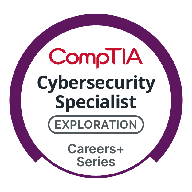
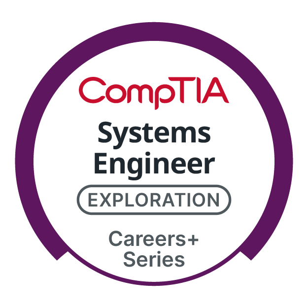
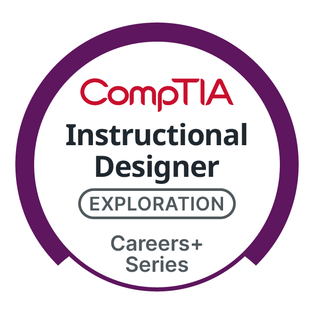
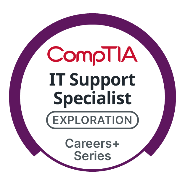
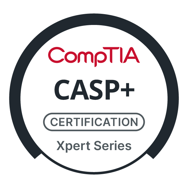
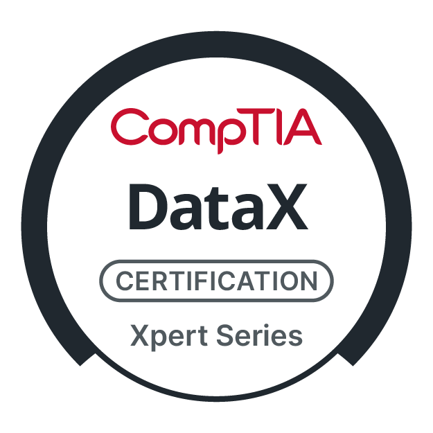
Product Logos
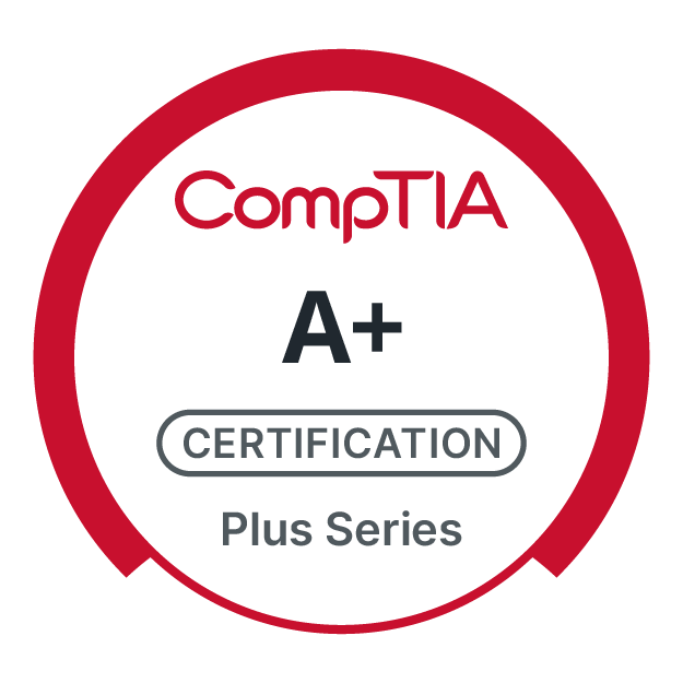
Plus Series: Foundational Skills
a+ Series: Entry-level
Expansion Series: Exploration
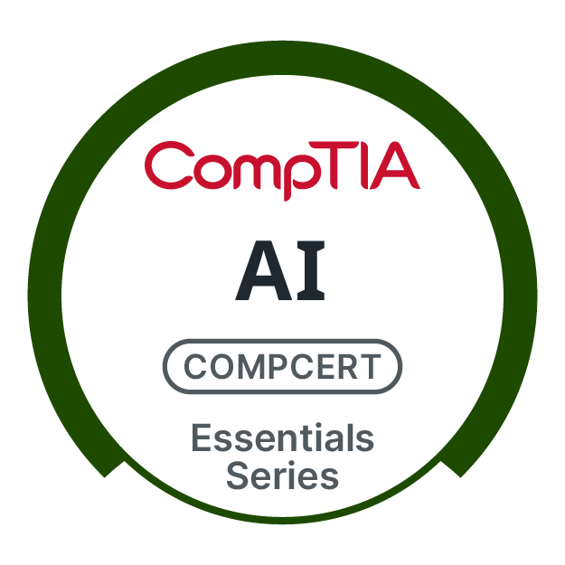
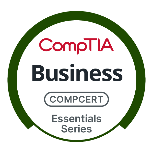
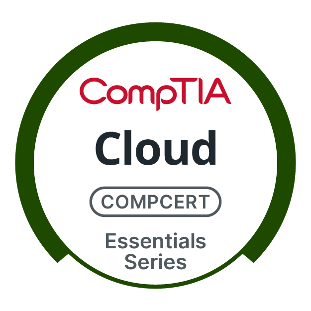
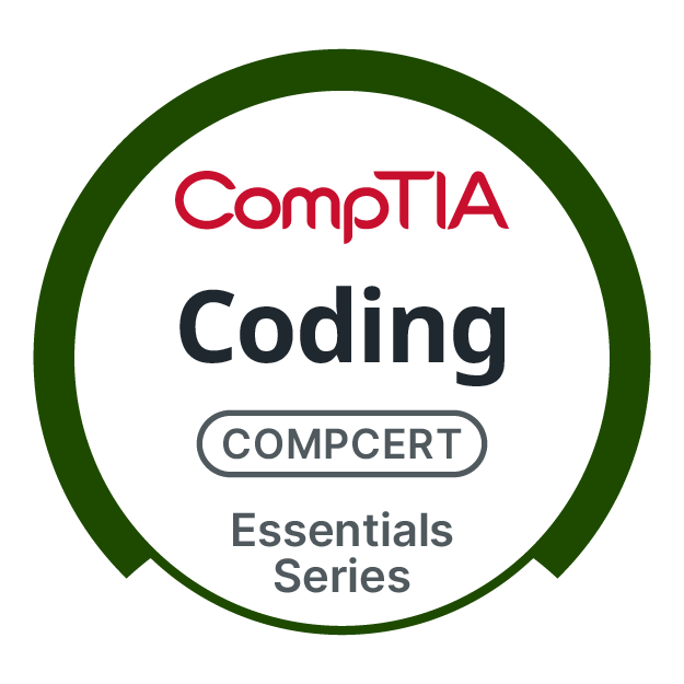
Essentials Series: Core Competencies
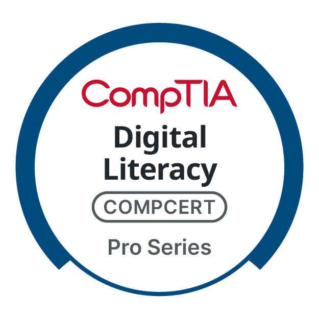
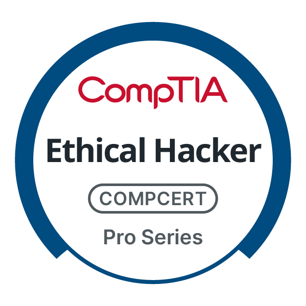
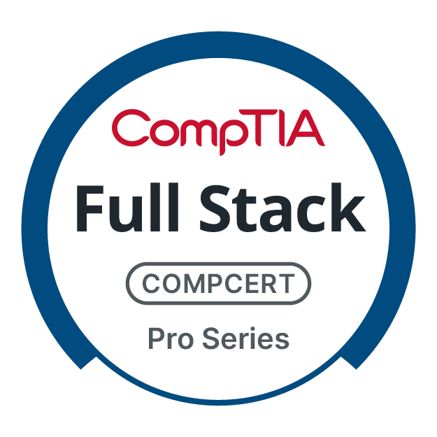
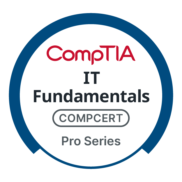
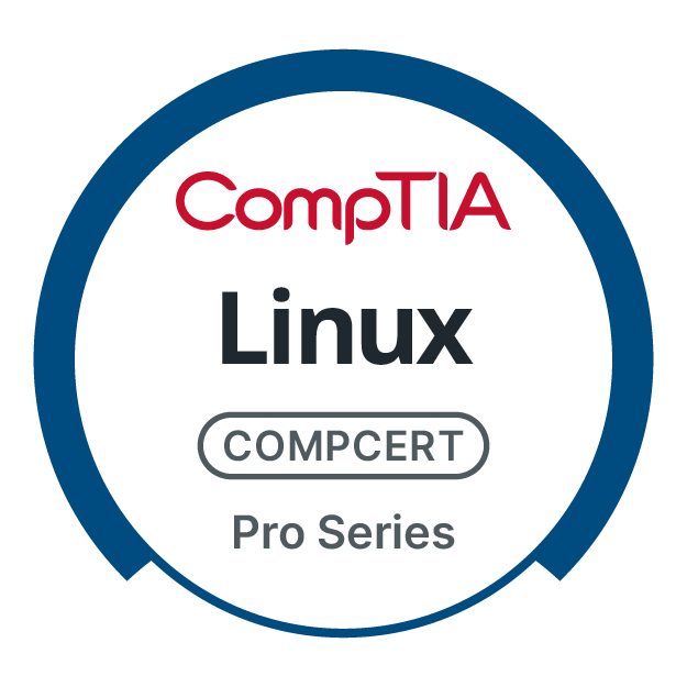
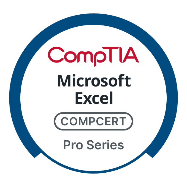
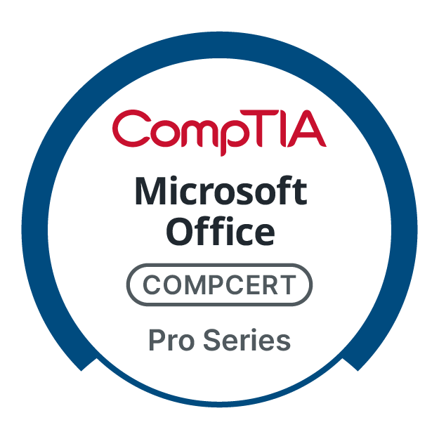
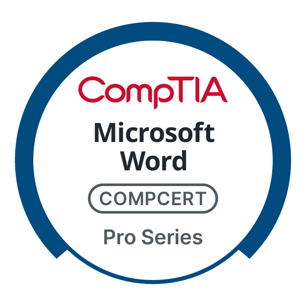
Pro Series: Established Professionals
Careers+ Series: Career Transitions
Xpert Series: Industry Experts


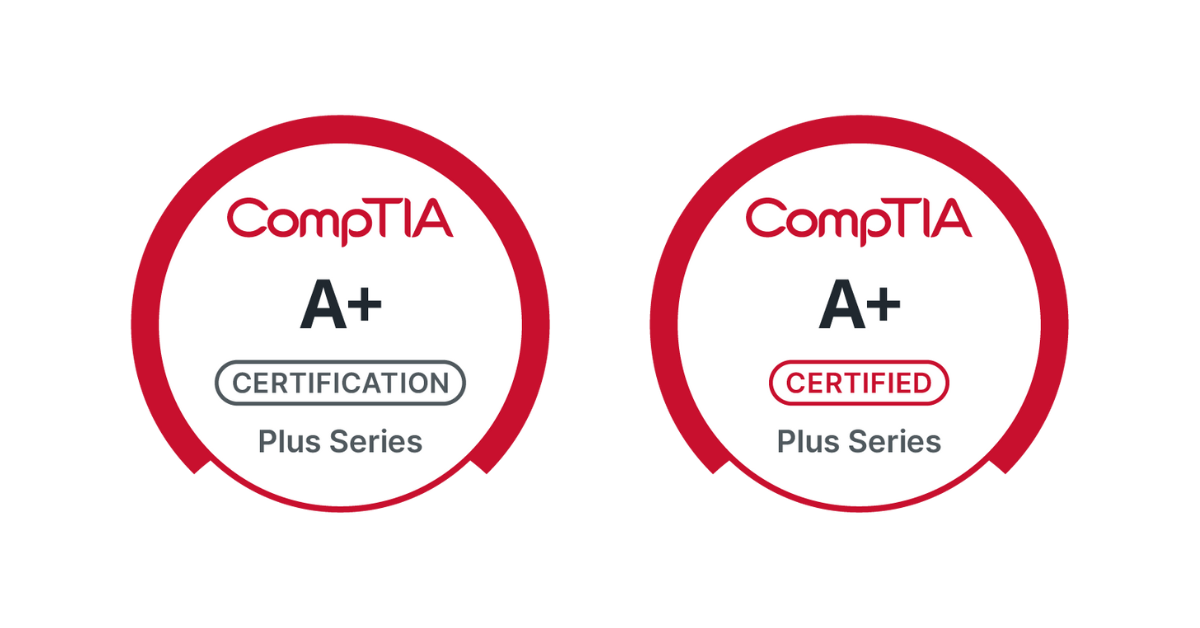
Certification vs. Certified State
Accessibility & Clarity
Ensured WCAG compliance through rigorous attention to contrast and legibility. Refined typography and clear labeling (e.g., 'certification' vs. 'certified' status visually distinguished) enhanced user understanding.
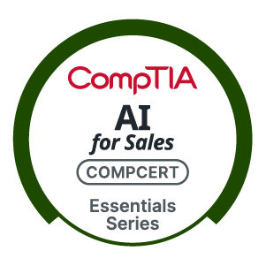
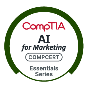
Subcategories
Industry-specific logos that are scalable and based on the main product, AI Essentials.
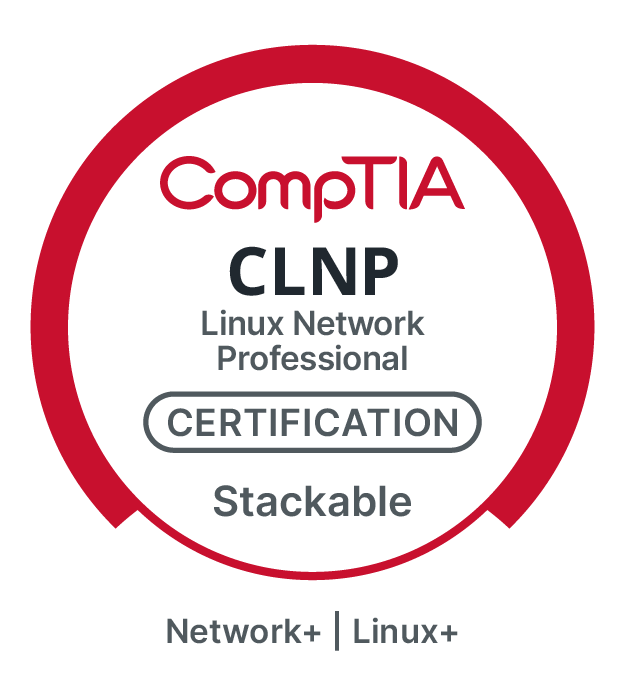
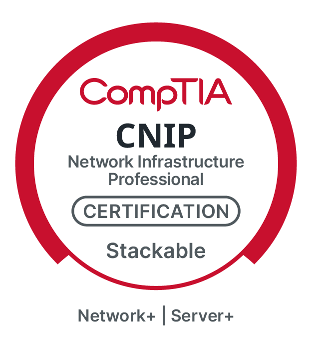
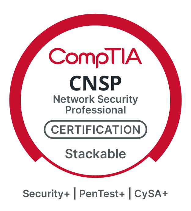
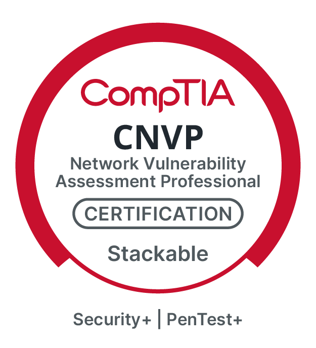
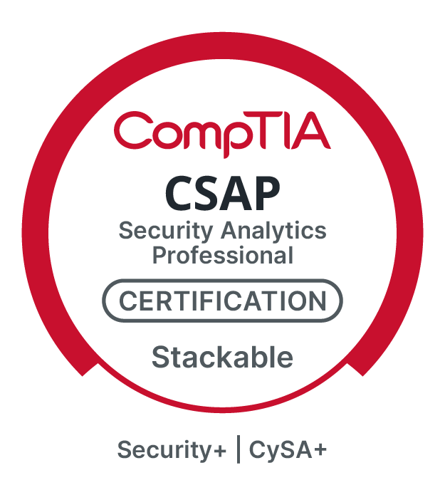
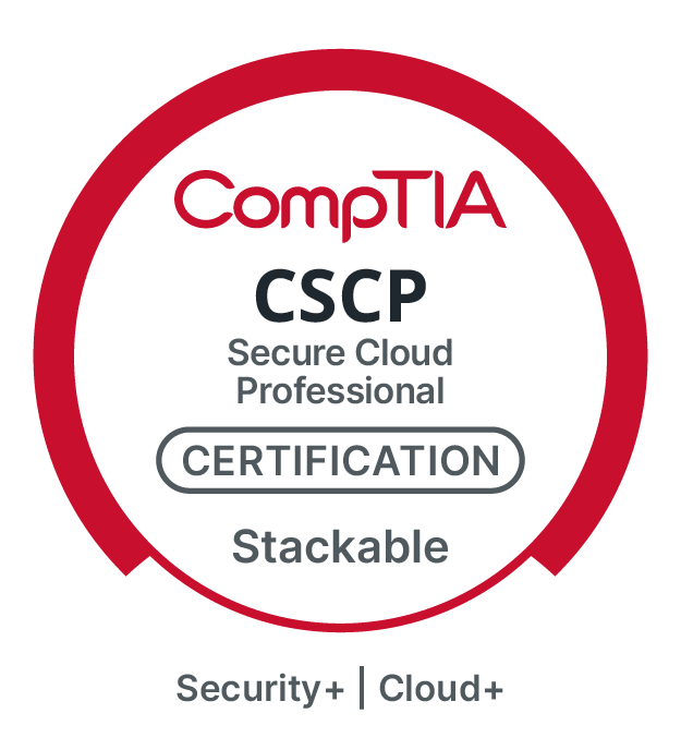
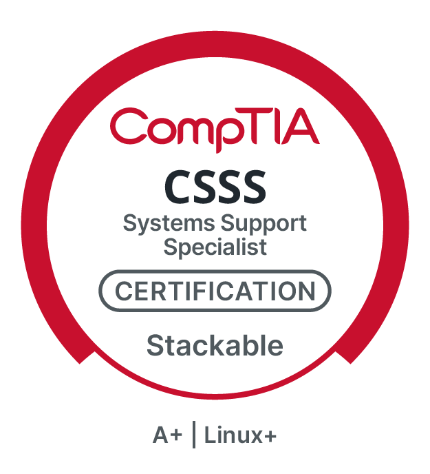
Stackable Certifications
Stackable certifications showcase earning multiple CompTIA certifications, demonstrating your knowledge and experience essential for advancing an IT career.


Systematic Flexibility
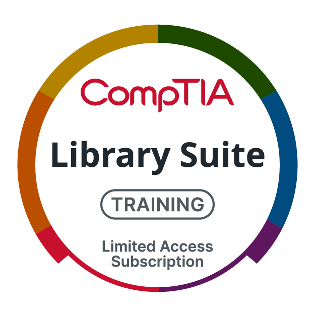
Developed a core logo structure adaptable for various use cases, including co-branding and future product variations, streamlining rollout, and ensuring legal compliance. The design system extended to stackable certifications and a unifying 'Library Suite' mark.
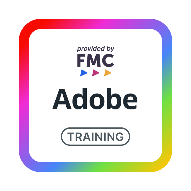
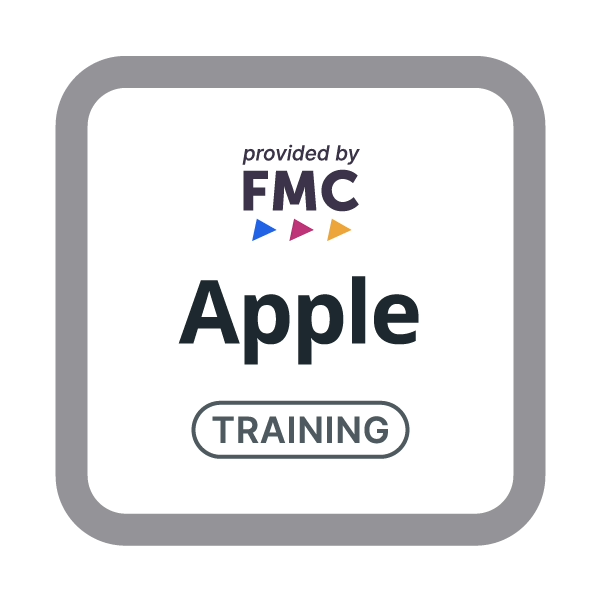
FMC Training Series
These logos represent the Future Media Concepts brand within the CompTIA ecosystem. FMC is a leading provider of training for digital media and specifically Apple ecosystems. These logos help distinguish these specialized third-party offerings from CompTIA's main certification products.
Impact
The redesigned logo system delivered measurable results:
Enhanced Brand Clarity & Consistency: Established a clear, instantly recognizable visual hierarchy across all certifications.
Improved Efficiency: Significantly reduced time and resources for creating and deploying branding assets.
Strengthened Brand Perception: Reinforced CompTIA's authority and forward-thinking approach, fostering stronger audience connection and internal alignment.
Website
This initiative successfully transformed a portfolio of disparate marks into a powerful, unified brand system, positioning CompTIA for continued leadership in the tech industry.