
Project Scope
Role: Logo Design System
Key Deliverables: OnDemand logo + Partner Logo Design System
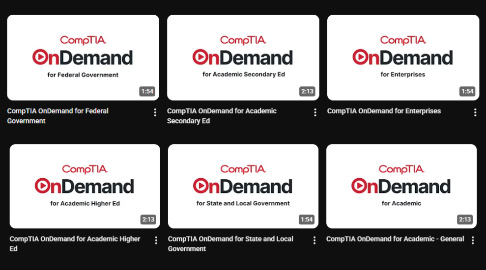
OnDemand Logo Design
CompTIA OnDemand is a facilitated learning solution aimed at organizations seeking to upskill or reskill their workforce with CompTIA certifications. It offers a blend of CompTIA's trusted learning materials, engaging instructional videos, and live expert support, all delivered flexibly through the Canvas LMS platform. The program emphasizes a structured, rewards-based environment designed to combat the hurdles of self-study and drive learner engagement, momentum, and certification success.
The core challenge was to create a logo that visually encapsulates the unique value proposition of OnDemand: the fusion of schedule flexibility with structured support and expert guidance.

Accessibility & Flexibility: Reflecting the on-demand nature and adaptable scheduling.
Credibility & Professionalism: Aligning with CompTIA's reputation as a leader in vendor-neutral certifications.
Impact
The OnDemand logo provides a distinct and meaningful visual identity that effectively represents the product's blend of flexible, supported, and engaging learning designed for certification success in the modern workforce.
Partner Logos Design
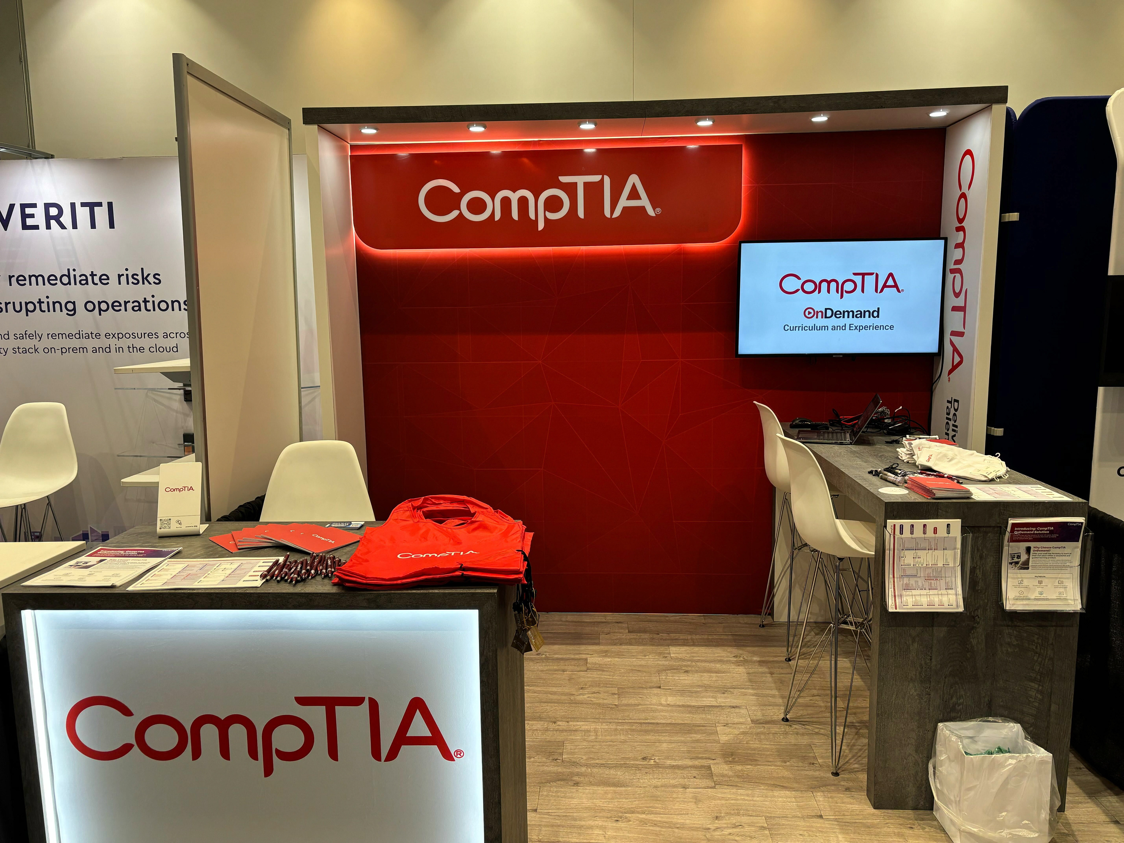
CompTIA partners are organizations officially recognized to deliver training, certification, and educational resources aligned with CompTIA’s vendor-neutral IT certifications. These partners play a crucial role in preparing individuals for careers in IT and cybersecurity by providing high-quality instruction and support.
Universal Color Tiers + Accessibility Considerations
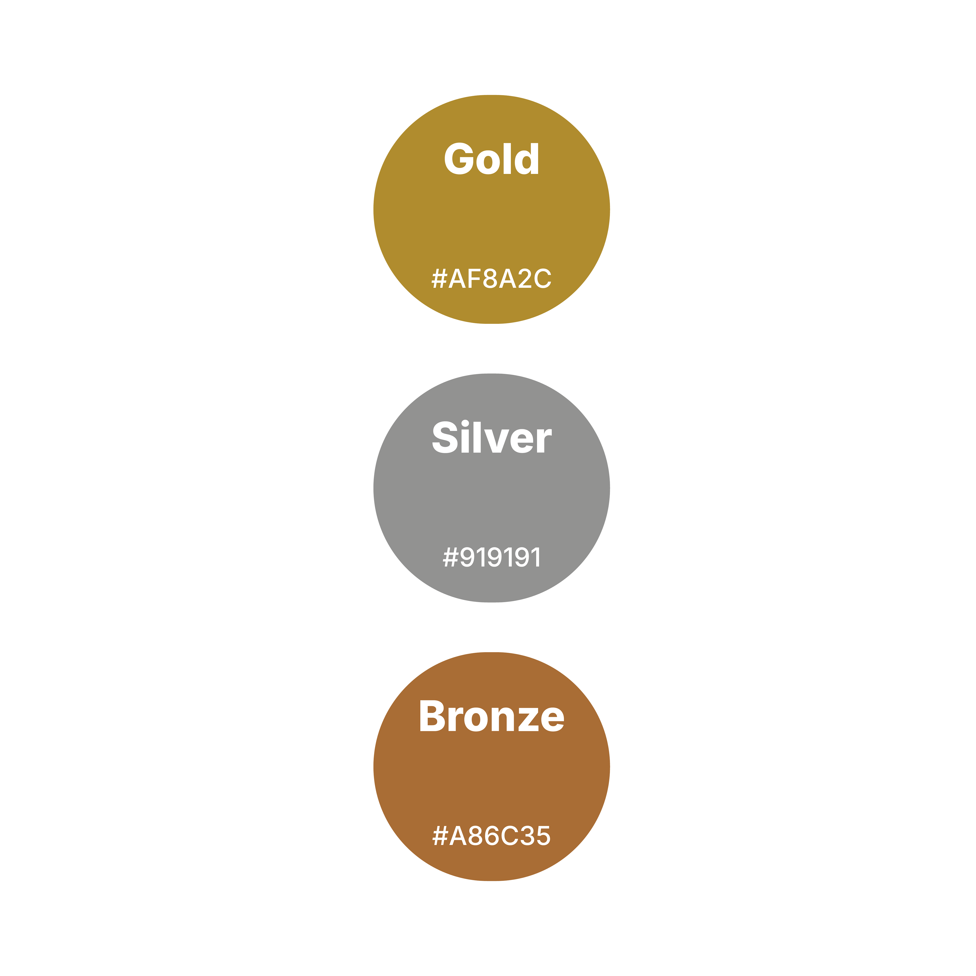
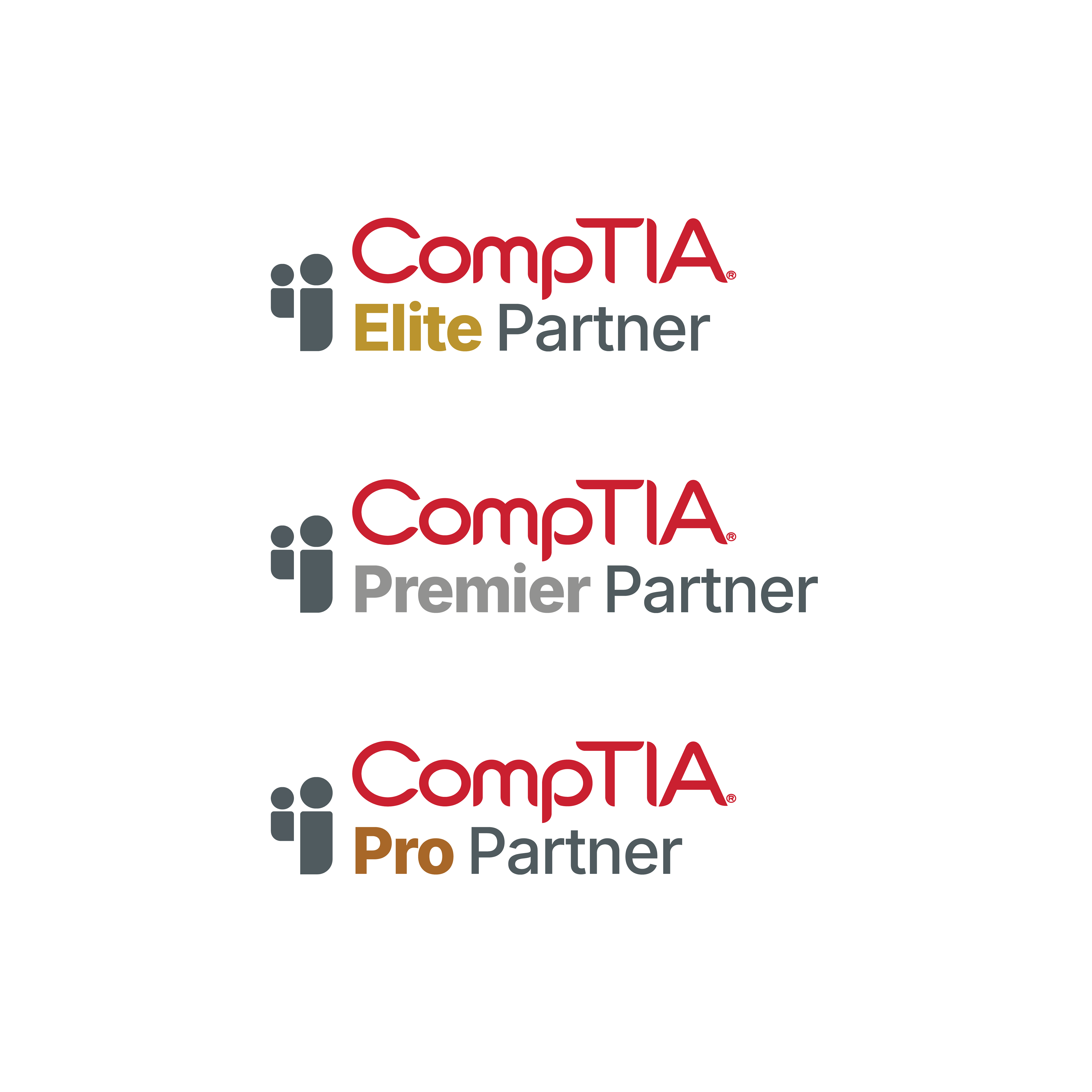
The hierarchy of gold, silver, and bronze immediately signifies partner status. This classic palette elevates the program's prestige and makes the tiers instantly recognizable.
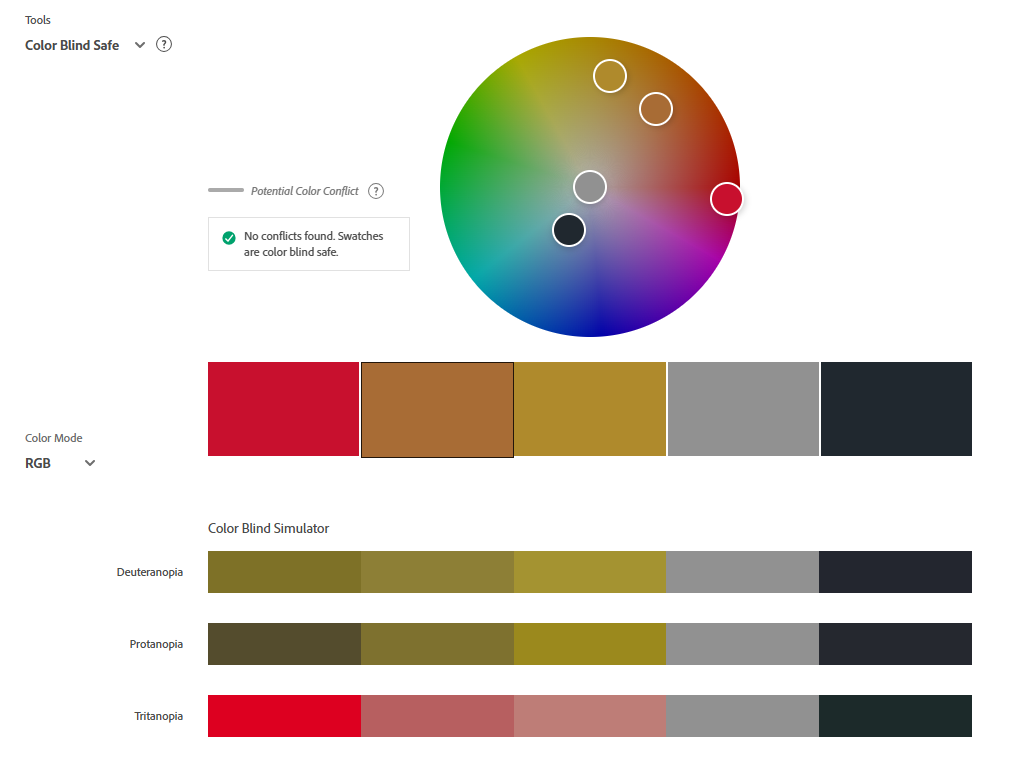
The color palette is color-blind safe and (WCAG) Web Aim Accessibility Guidelines compliant.

Symbol of Partnership
A clean, modern icon of two figures represents the collaborative nature of CompTIA's partnerships. A neutral grey reinforces the alliance theme across all tiers without competing with the primary color.
Asymmetrical Balance
The typography strategically emphasizes the partner tier while maintaining visual harmony. The tier name is prominent, while the partner text is matched to the grey of the symbol, creating a balanced and cohesive lockup.



Future-Proof Design
This logo design system is built for growth. The design is scalable, allowing for new tiers and naming conventions to be added seamlessly in the future without disrupting the core visual identity.
Impact
This design concept delivers a sophisticated, at-a-glance solution that celebrates CompTIA's partners and is flexible enough to evolve with the program. It provides a visual identity worthy of these partners' commitment: bridging the global tech skills gap and aligning with a recognized leader to equip the workforce for the future.