
Project Overview
I led the creative overhaul of Benetech's marketing and sales ecosystem, transitioning the brand from a legacy industrial look to a cohesive identity rooted in innovation, safety, and technical reliability. The rebrand touched every touchpoint, from new products, technical data sheets, catalogs, and promotional social media graphics to new 3D-modelled motion graphics/video simulations.
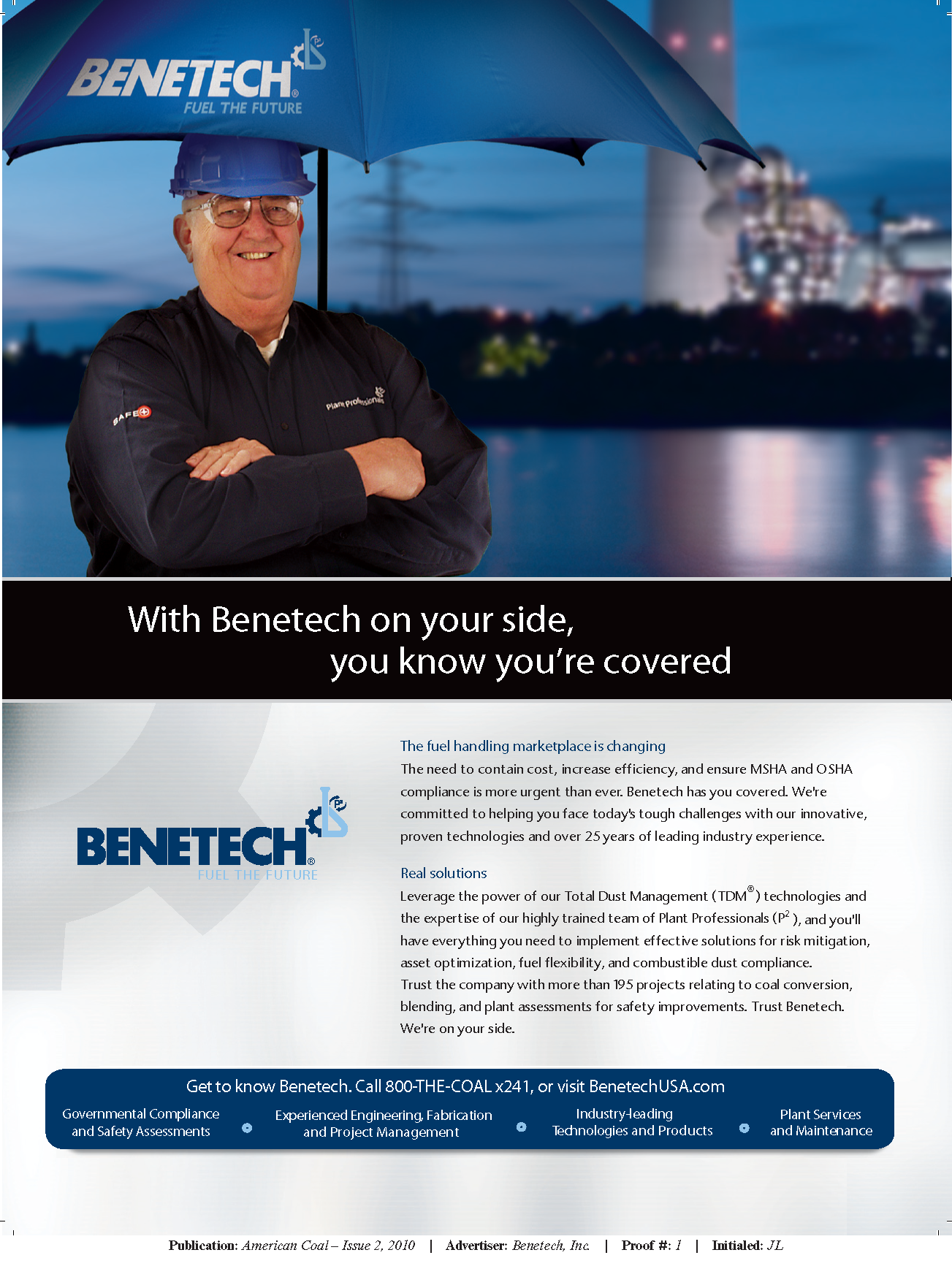
The Challenge (Before)
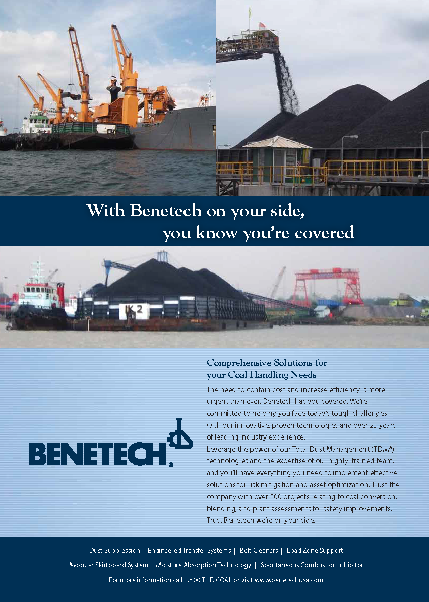
The previous marketing materials lacked a unified visual hierarchy. Key issues identified included:
Inconsistency: Varied layouts and font treatments made the brand feel fragmented across different documents.
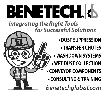
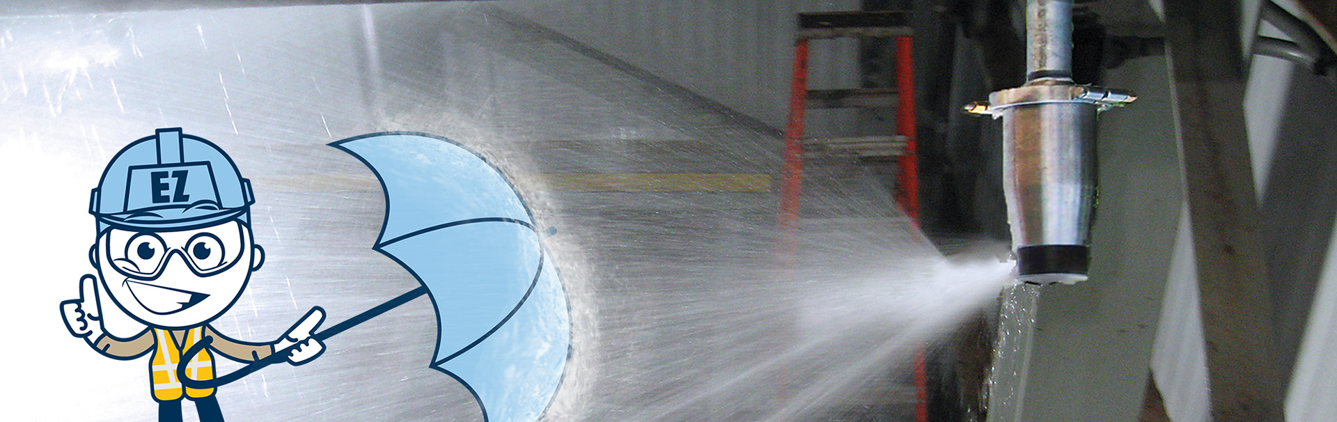
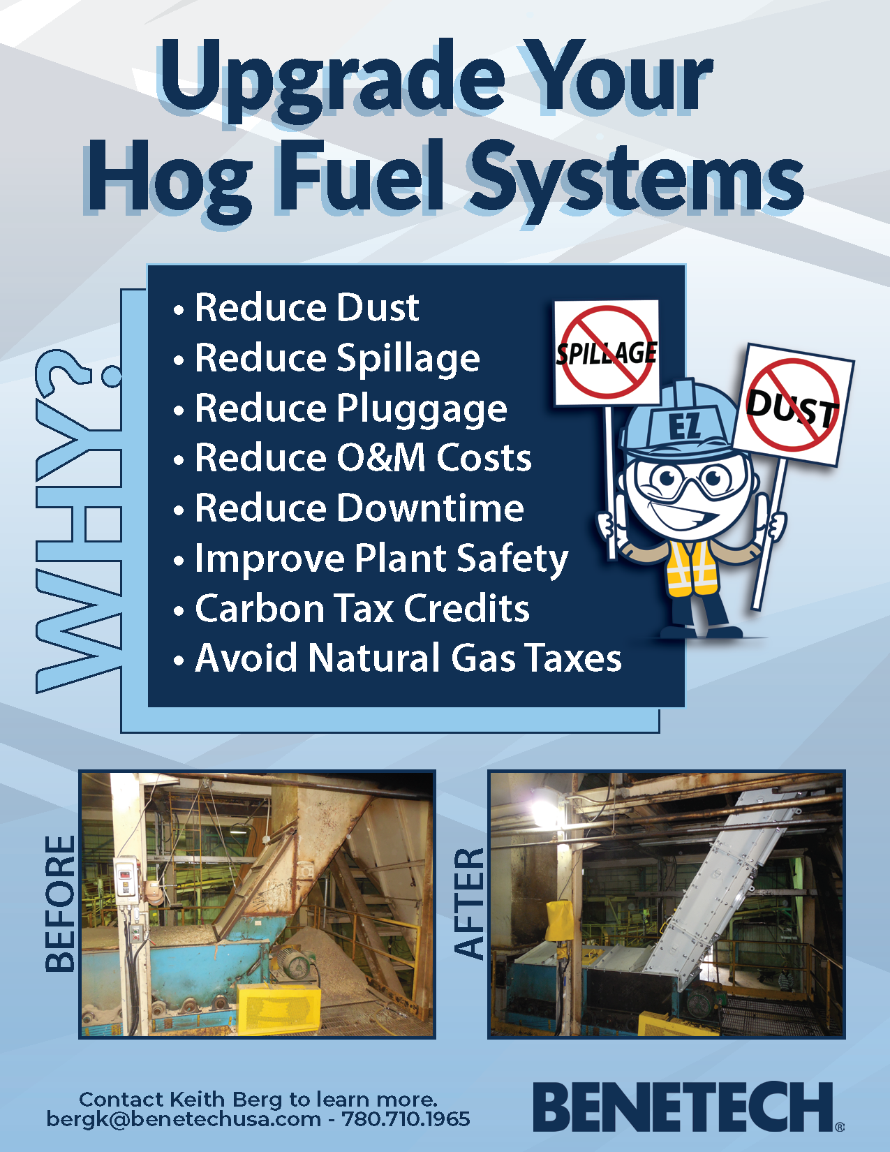
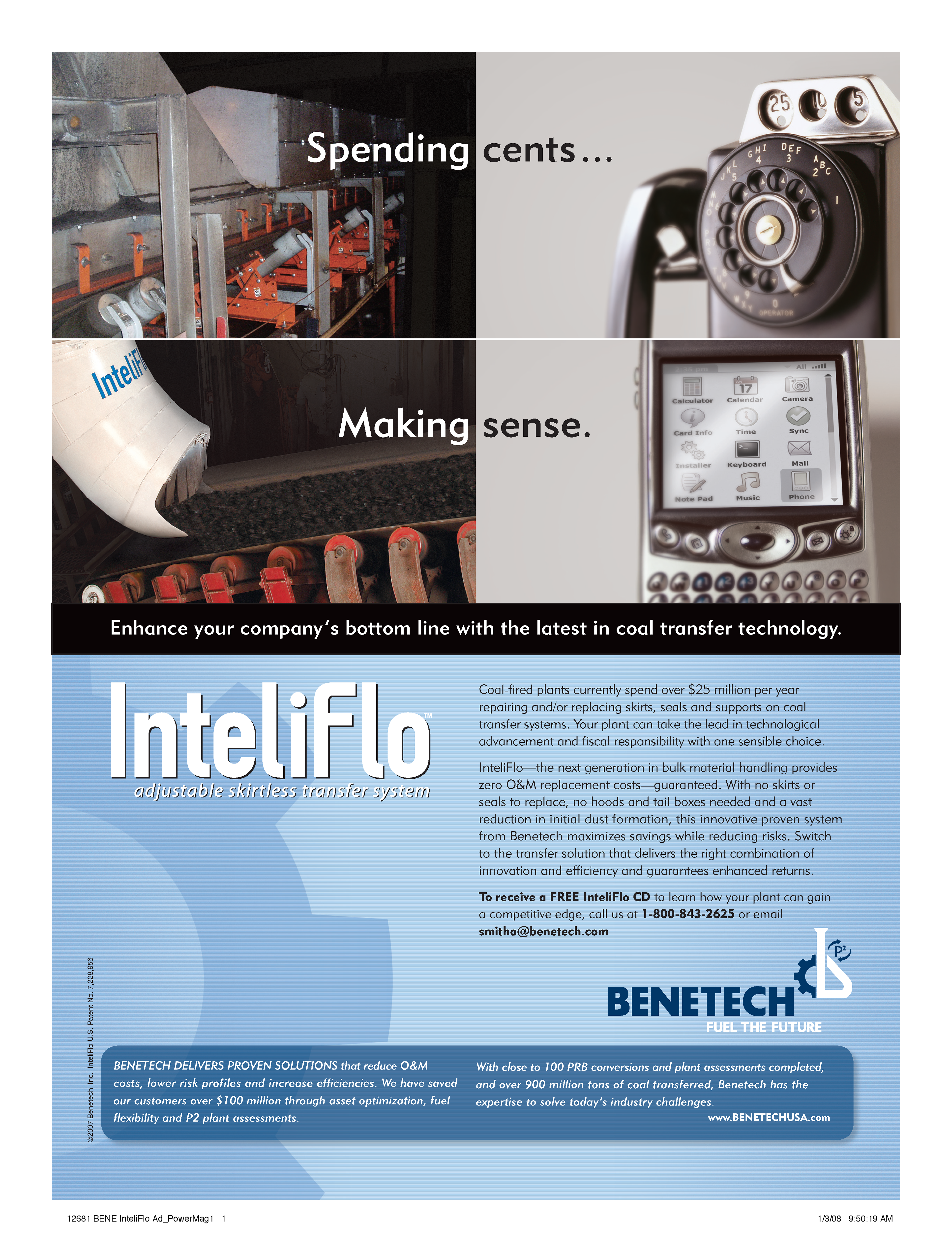
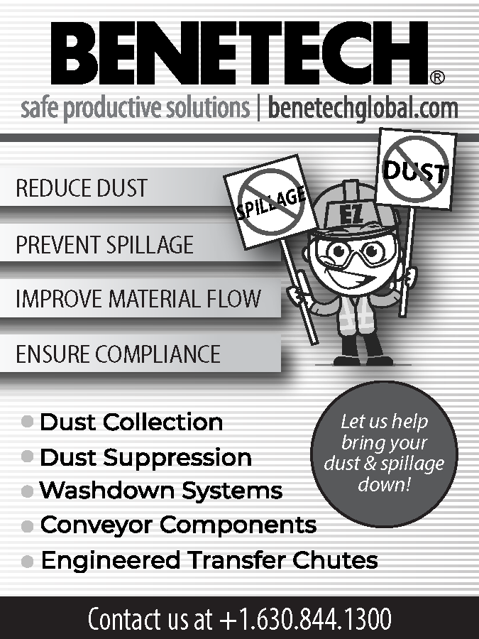
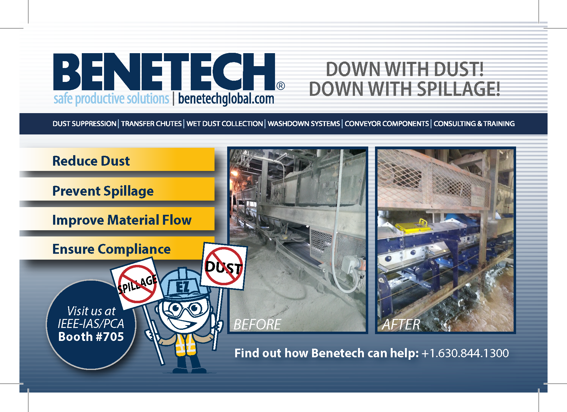
Tone Mismatch: A legacy cartoon mascot appeared in various materials, which clashed with the serious nature of industrial safety and diluted the professional authority required for enterprise-level contracts.
Clutter: Older layouts were text-heavy with tight margins, making technical information difficult to scan.
Dated Aesthetics: The use of stock imagery and unrefined color applications led to a look that didn't fully convey the company's modern capabilities.


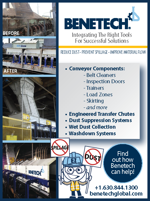


The Solution (After)
The rebranding effort introduced a structured design system focused on clarity, strength, and professionalism.
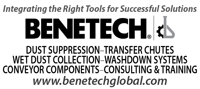
Visual Identity System
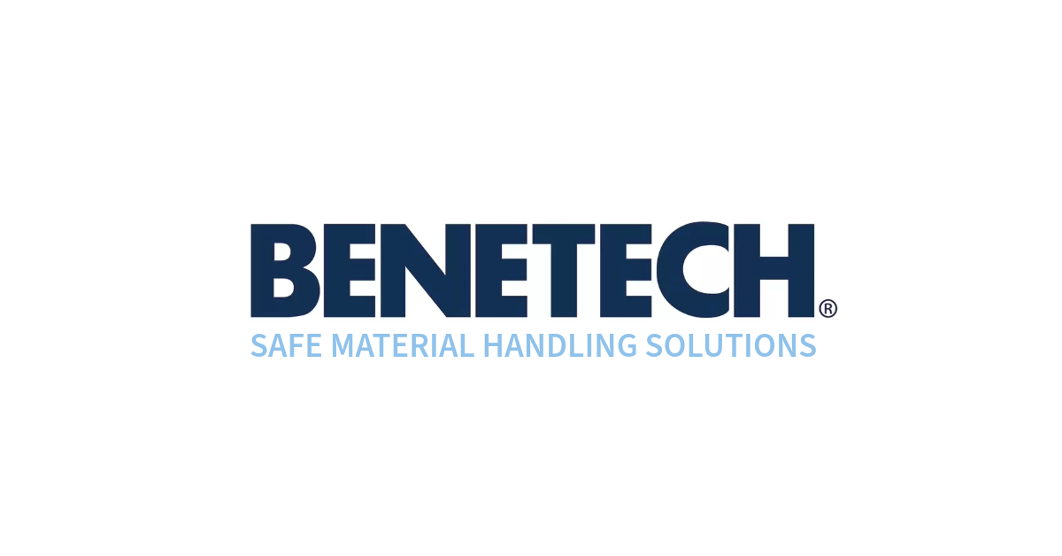
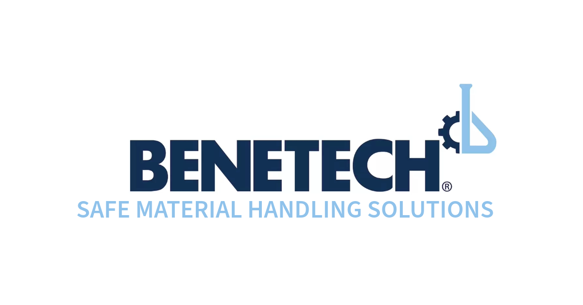
Tagline: I consolidated the taglines into a single, defining statement:
"Safe Material Handling Solutions." This unified tagline now anchors all marketing materials, clearly communicating the company's dual focus on safety and efficiency.
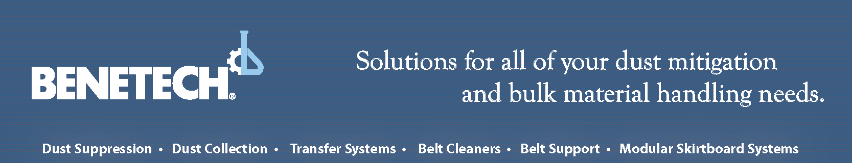
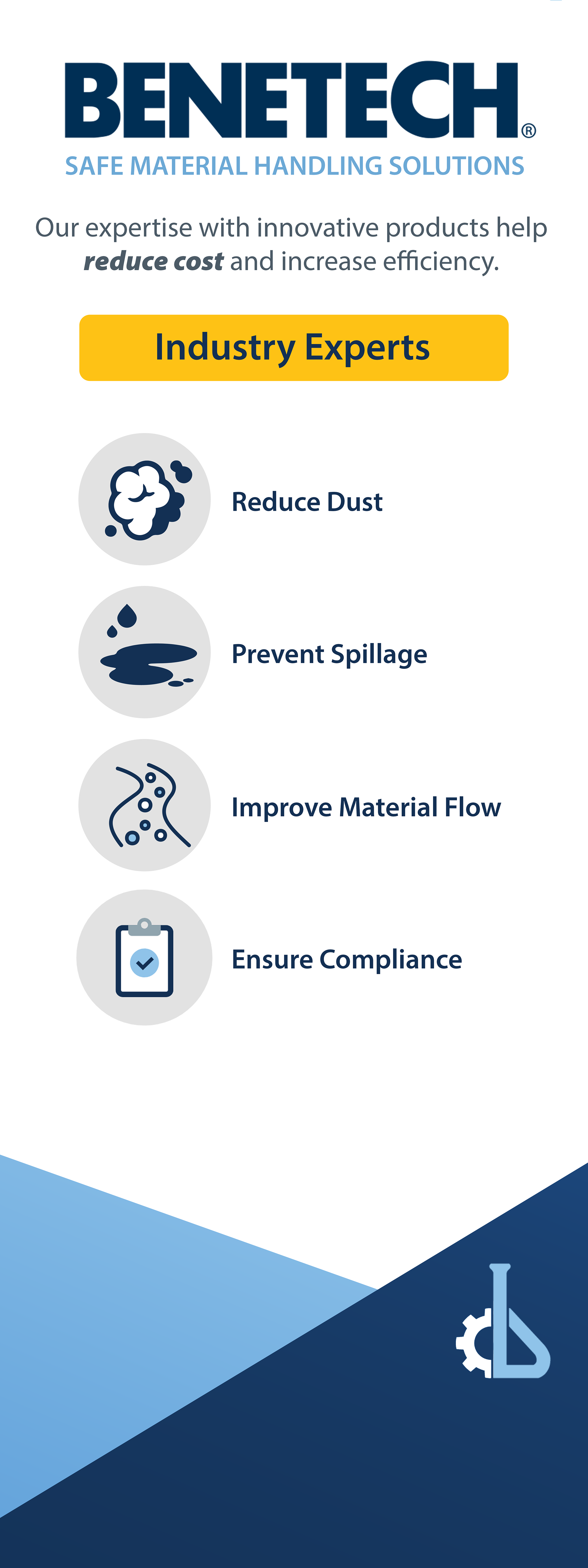
Color Palette: Established a new hierarchy with Deep Navy (Authority) and Sky Blue (Innovation), using Industrial Gold strictly for safety highlights and CTAs. Incorporated clean whites and soft grays provide necessary negative space (white space) to improve readability.
Typography: Transitioned to strong, geometric sans-serif typefaces, Montserrat, that offer high legibility for technical data while maintaining a bold presence in headlines.

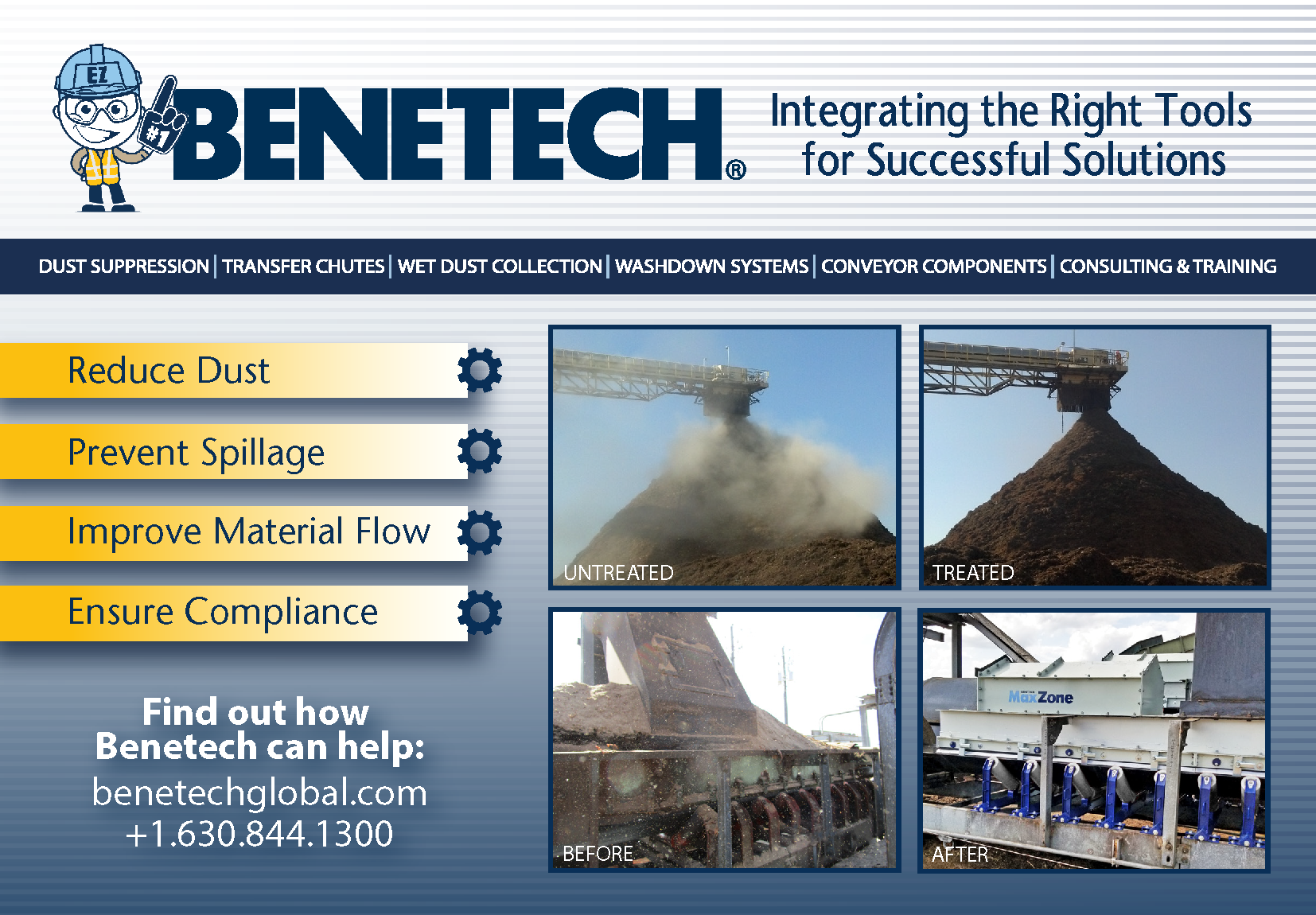
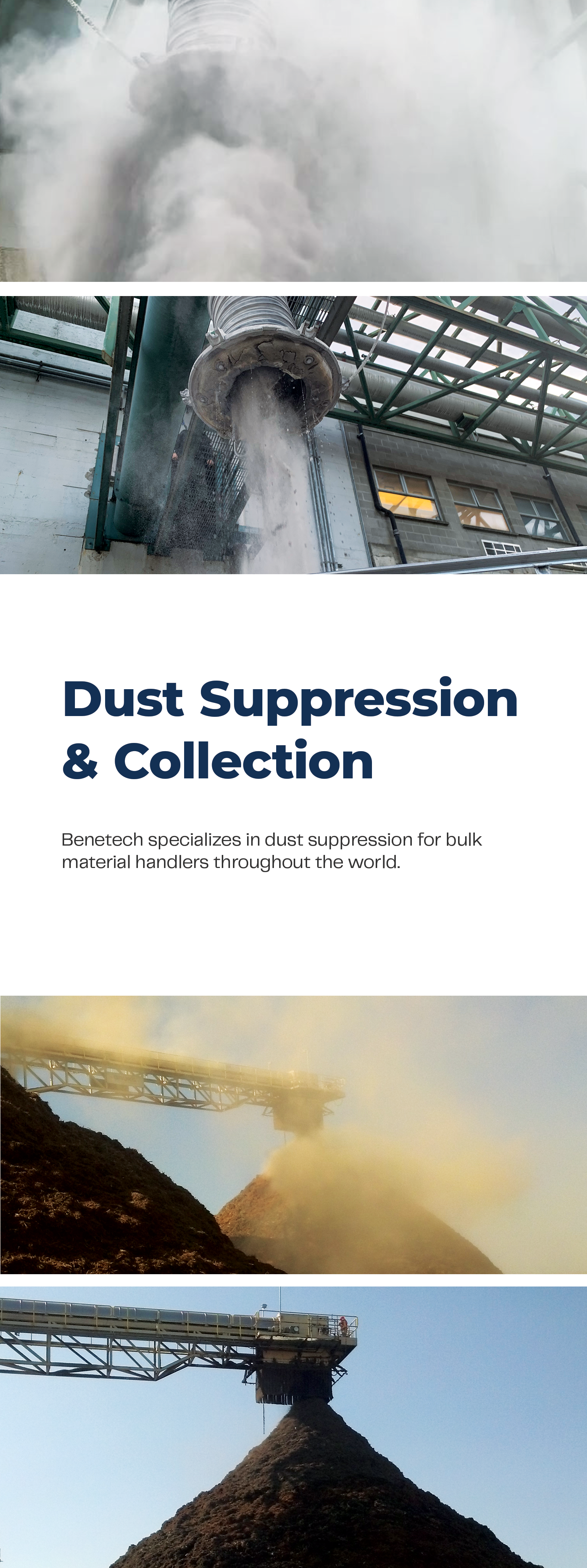
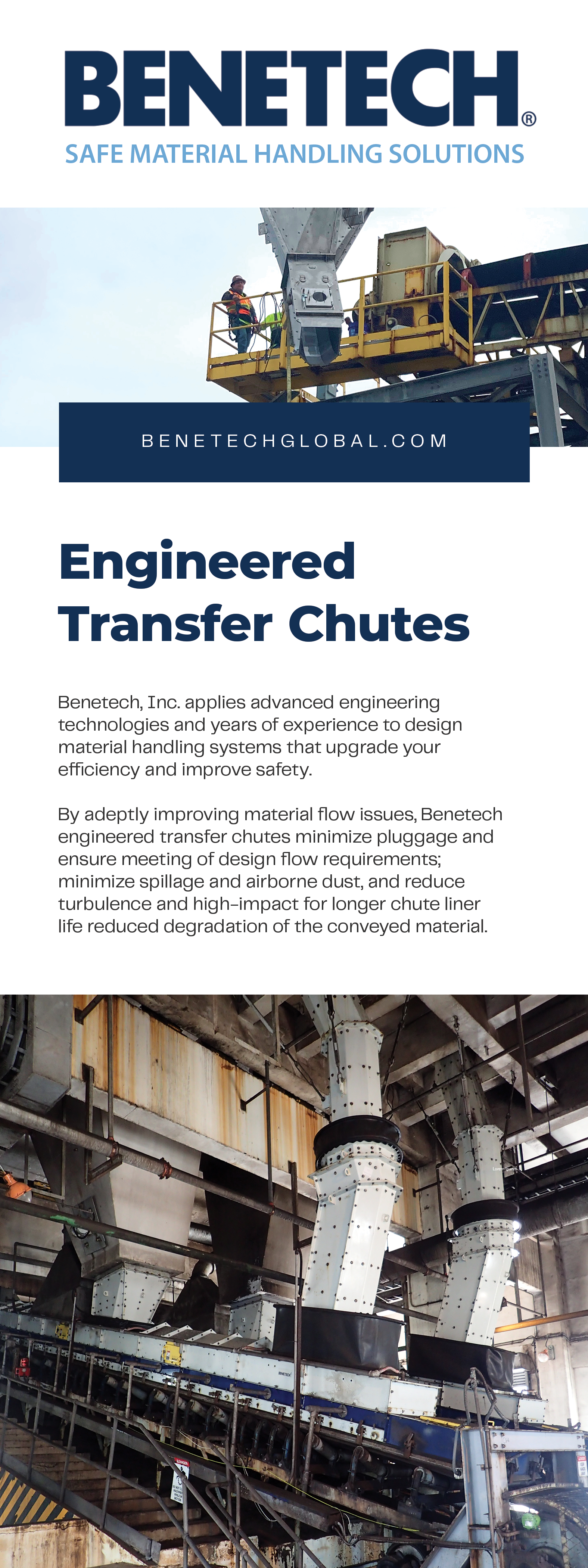
Promotional Marketing
For top-of-funnel marketing materials, I prioritized impact and engagement.
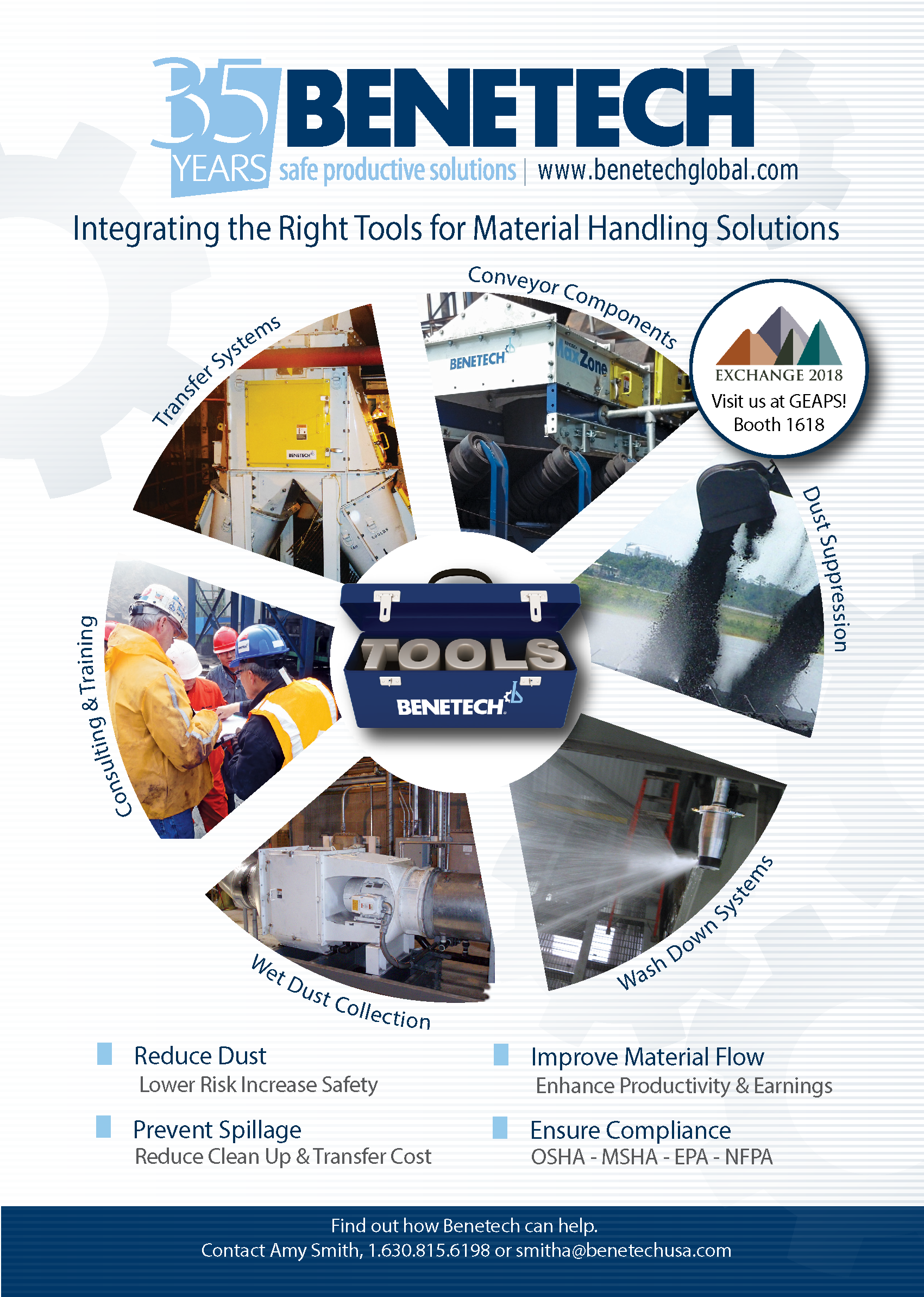
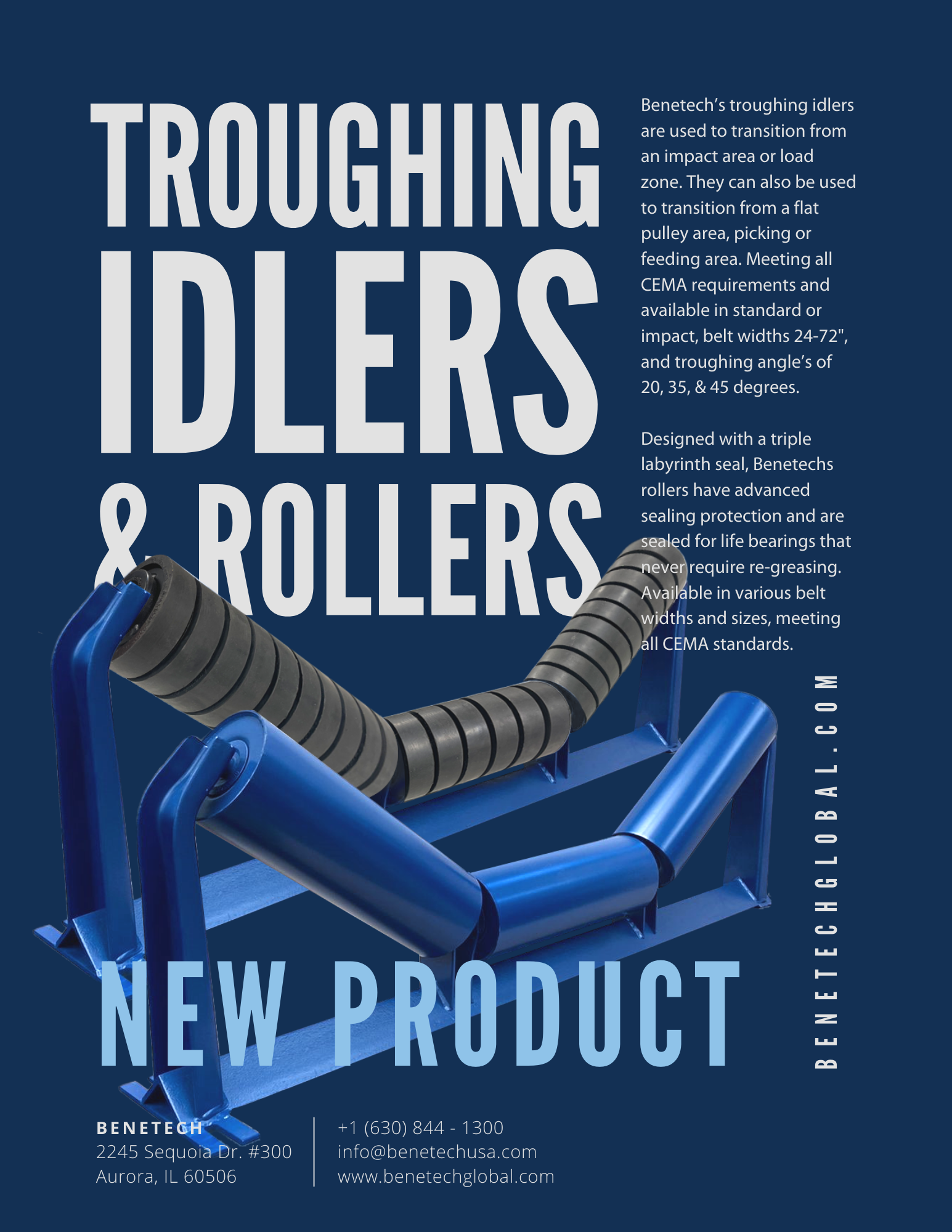
Bold Aesthetics: These flyers use a deep navy background and high-contrast imagery to stand out at trade shows and in sales meetings.
Data Visualization: The layout emphasizes strong typography and clear value propositions to capture attention immediately.
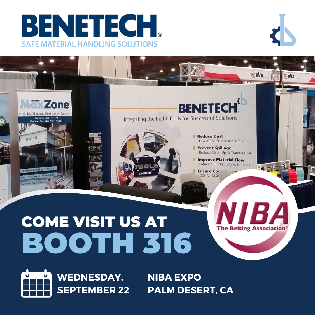
Flyers


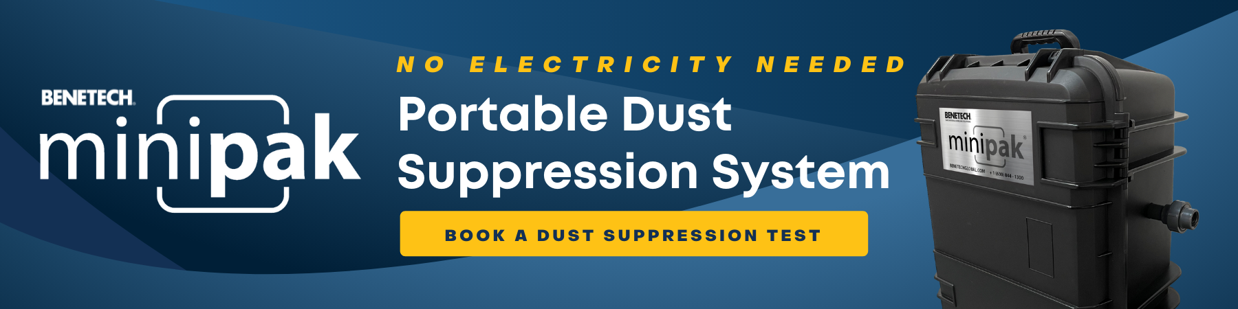
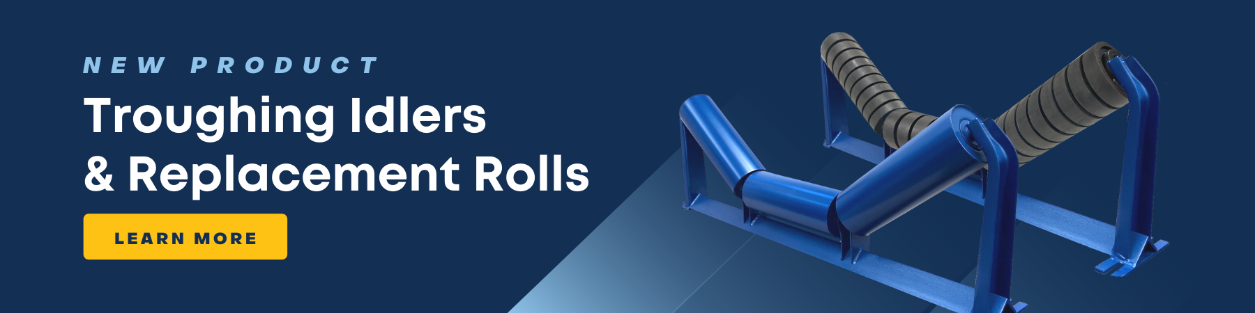
Email Advertisements
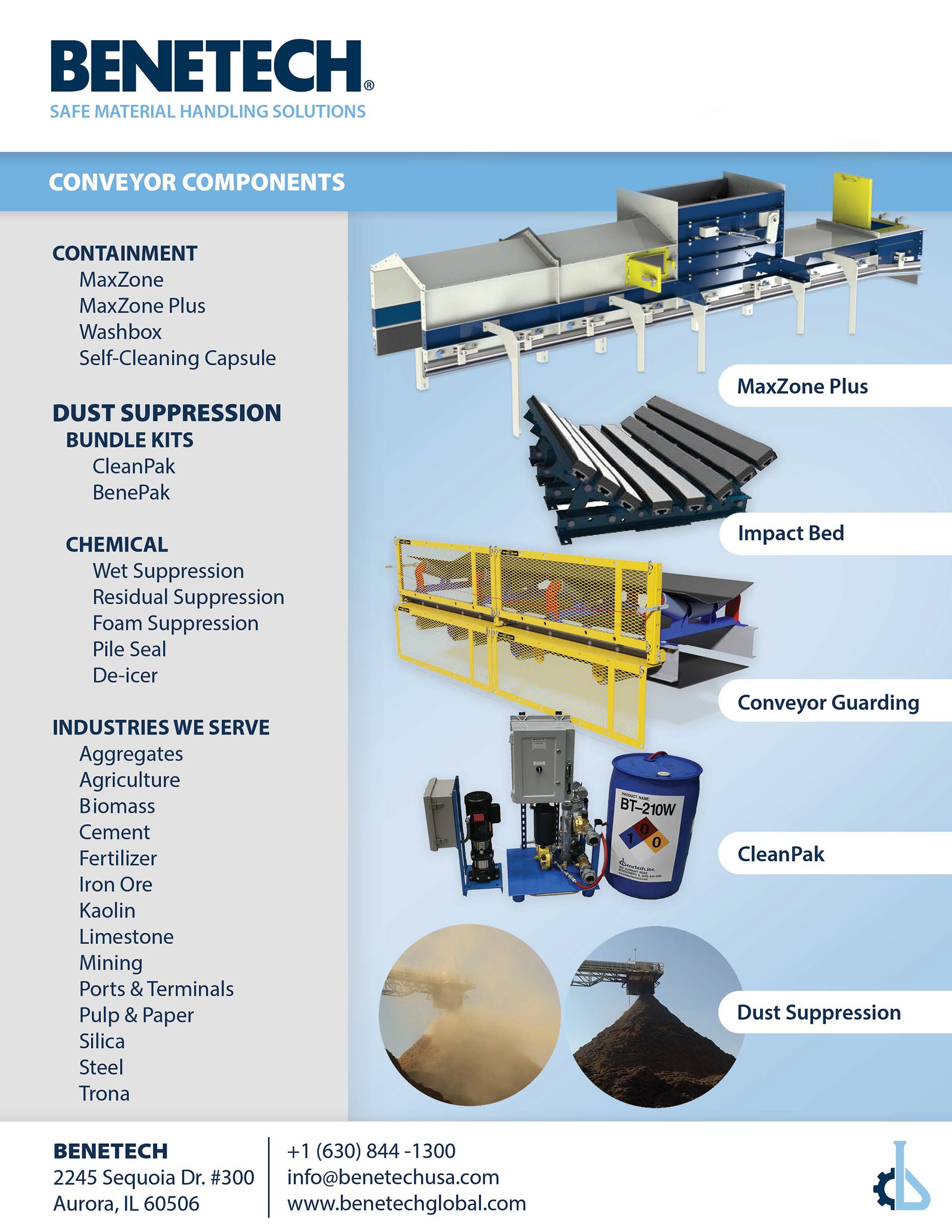
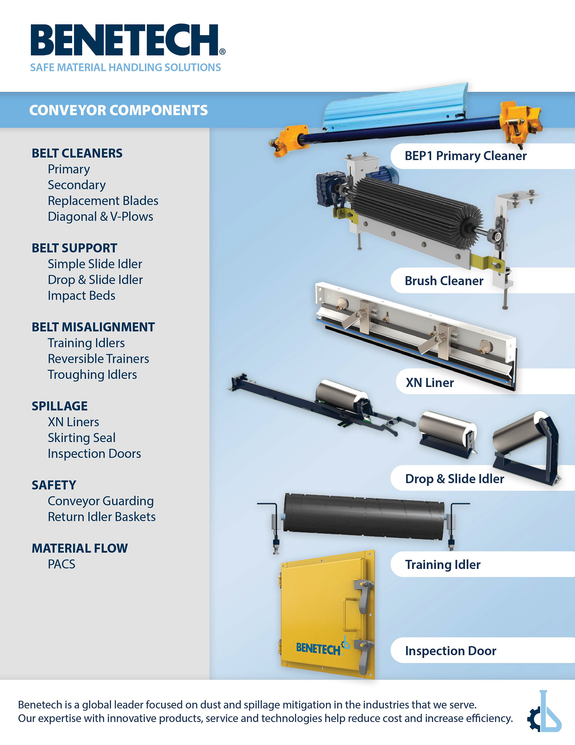
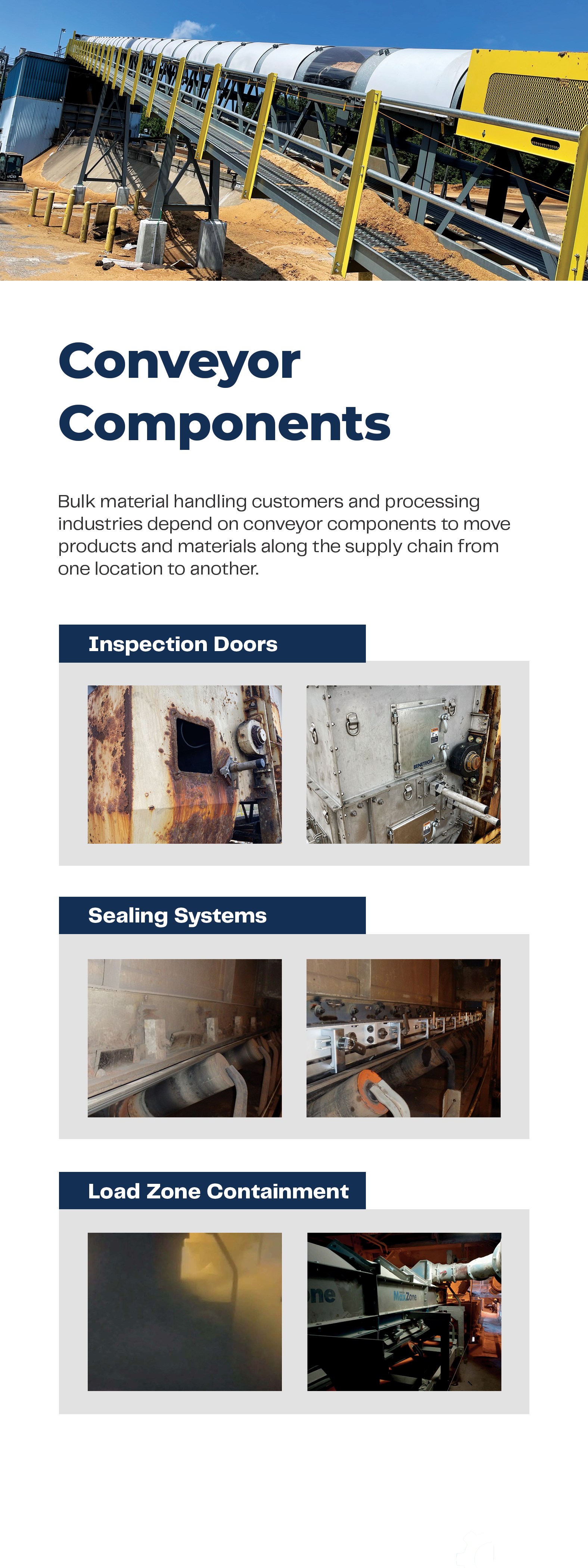
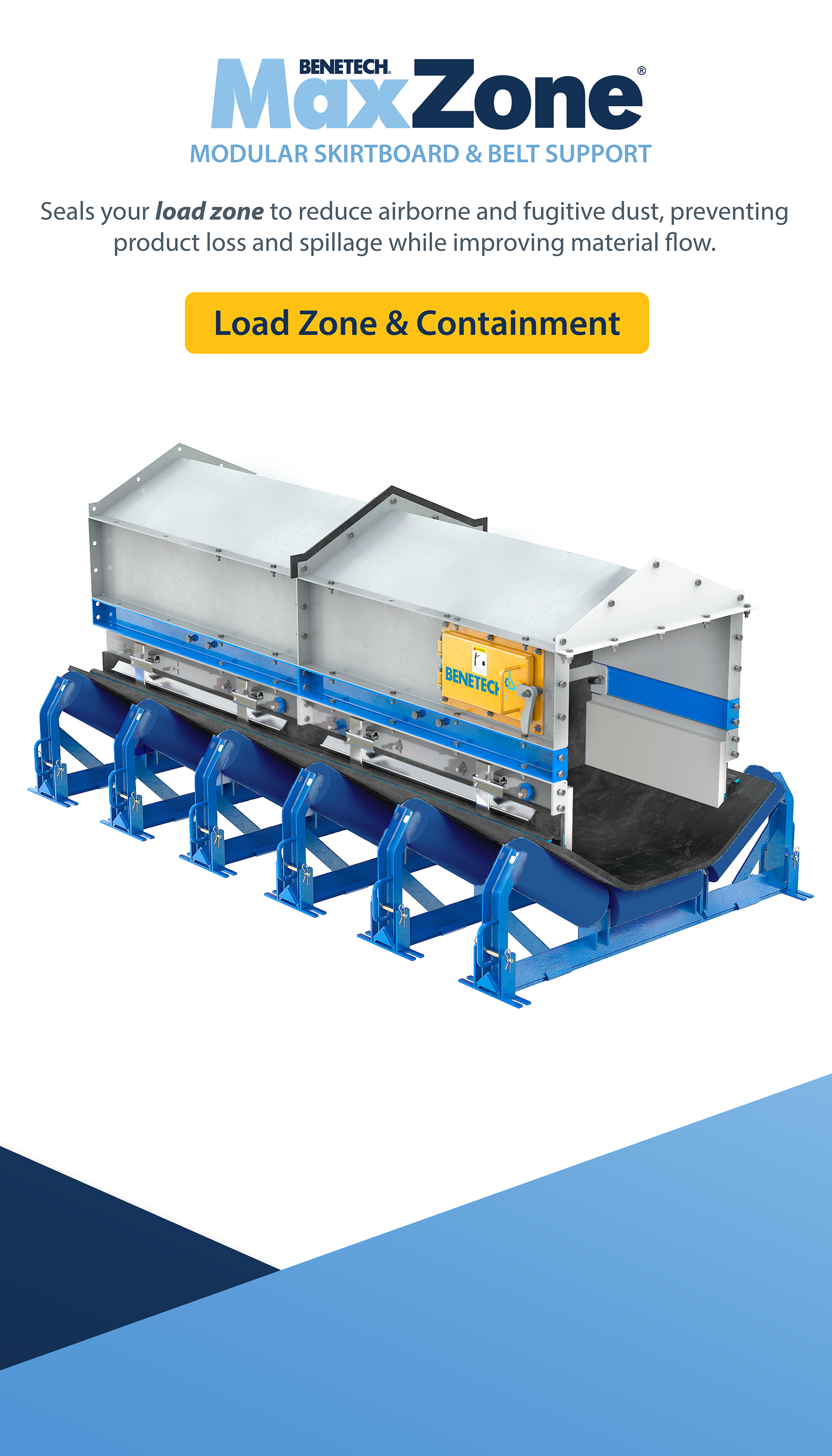
Technical Documentation
For product specifications, clarity was the primary objective. I shifted to a clean, white-dominant layout to improve readability.
Modular Grid System: A strict grid effectively organizes dense information.
Data Visualization: Technical specifications were redesigned into clean blocks of information, making it easy to review data points without visual fatigue.
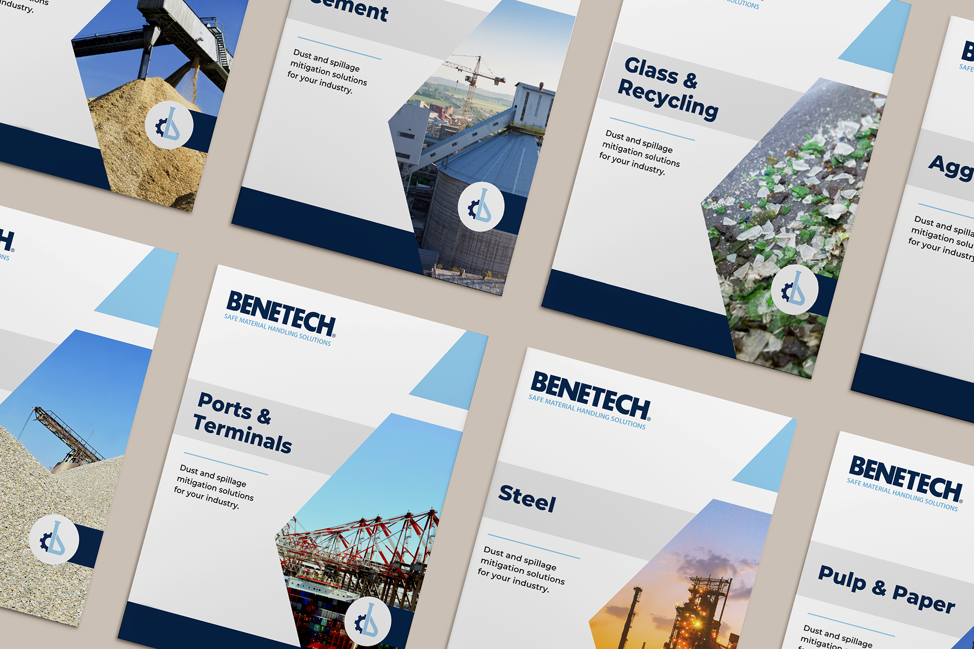
Industry-specific Catalogs
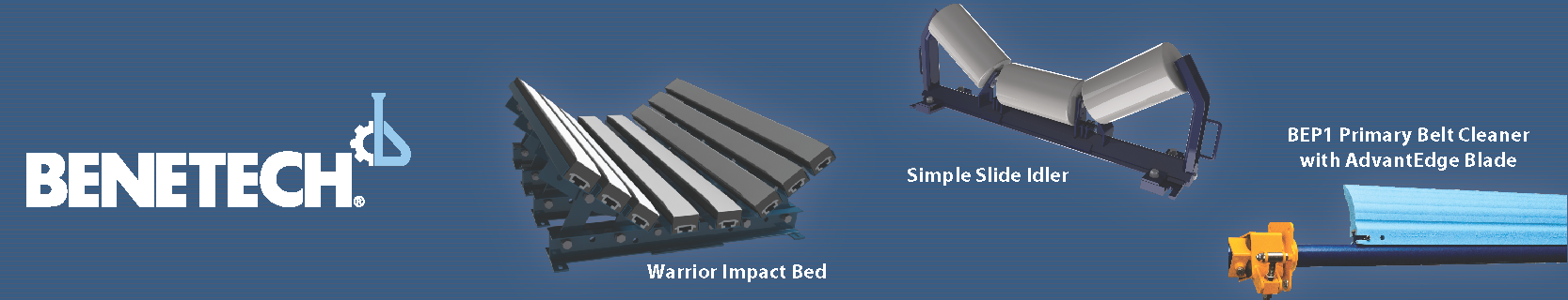
Product Line Card
Tradeshow Design 1

Tradeshow Design 2

Technical Posters
Digital & Event Marketing

Impact
The result is a polished, enterprise-ready brand identity. The new Benetech look communicates efficiency and technological leadership, positioning the company not just as a supplier, but as a modern solution provider in the material handling industry.