
Project: CompTIA Global Brand Unification
Role: Creative Direction, Brand Strategy & Design System Architecture
The High-Level Strategy
Challenge
As a leading global tech organization, CompTIA’s brand had grown organically, resulting in a fragmented visual ecosystem. The identity featured over 30 loose colors and inconsistent design elements across departments. This lack of standardization diluted brand recognition and created inefficiencies for internal teams.
Audit of previous legacy branding:


Vision
My role was to architect a unified visual language. I established a modernized creative vision that resonates with a diverse, tech-savvy audience while maintaining the brand's integrity. The goal was to move from "making assets" to "building a system," a complete strategic unification of CompTIA’s global presence.
The Design System
Establishing the Framework
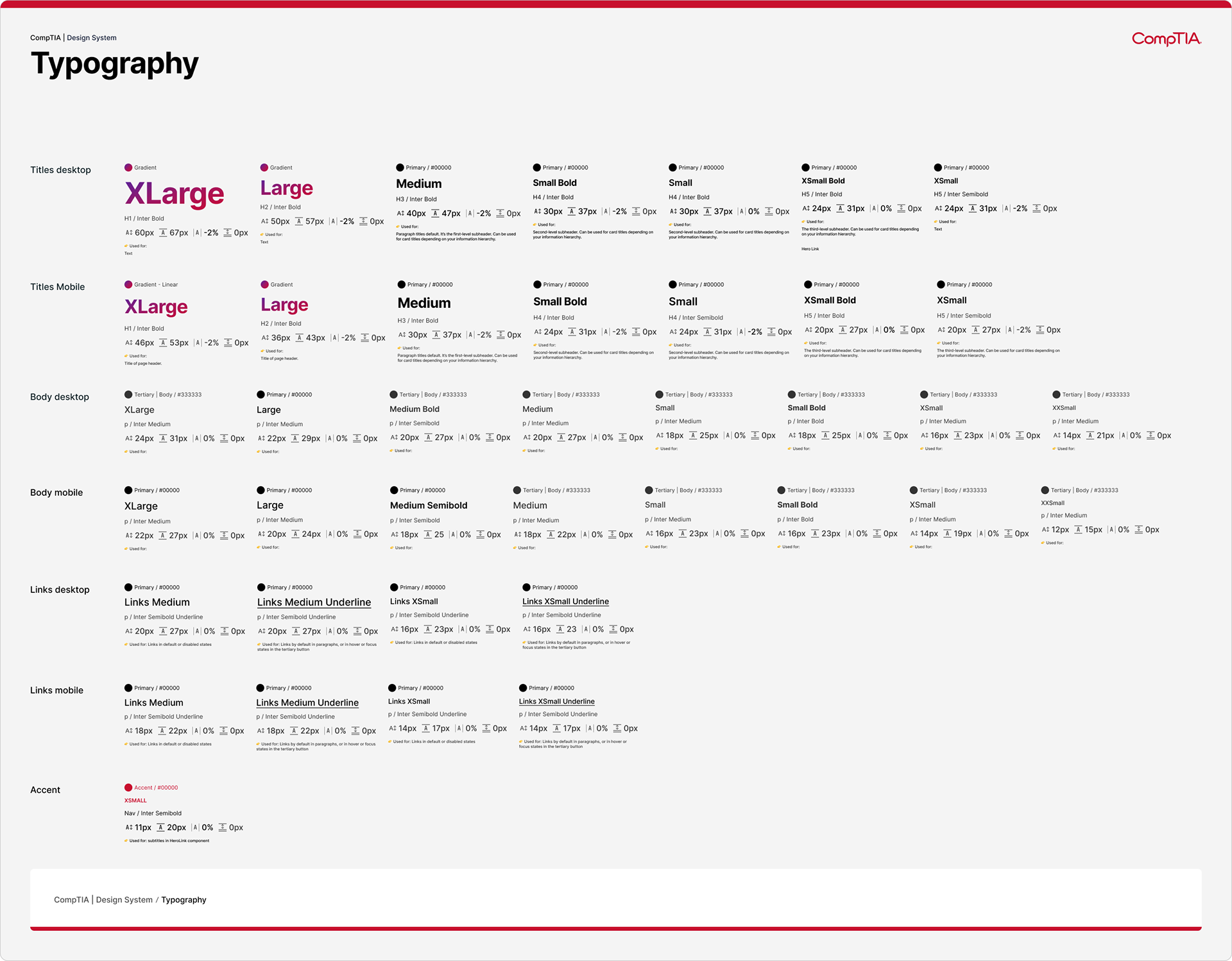
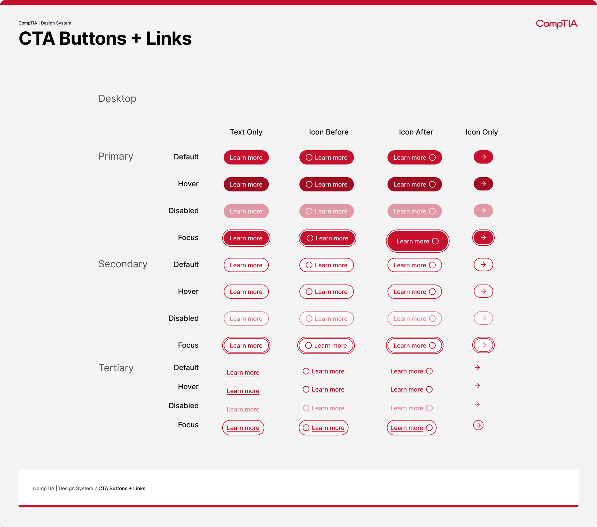
To ensure consistency at scale, I developed robust brand guidelines that standardized typography, color hierarchies, and visual treatments.
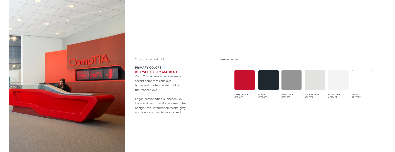
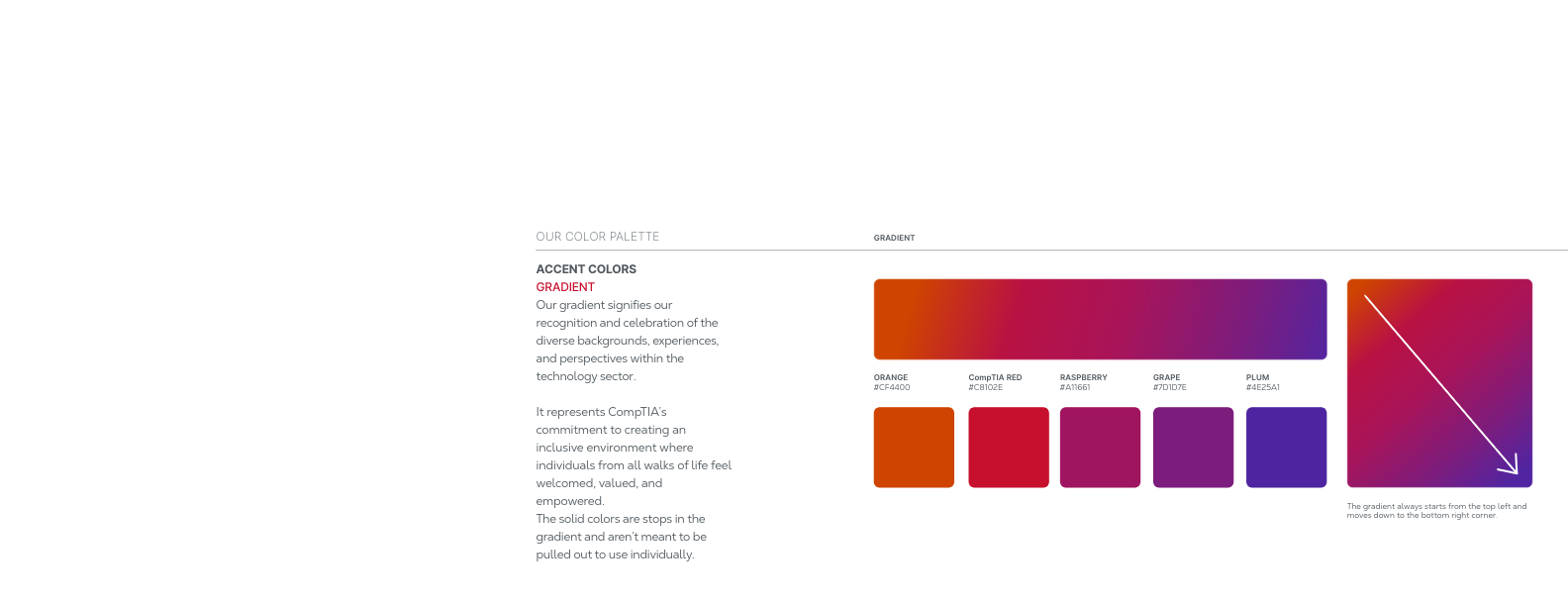
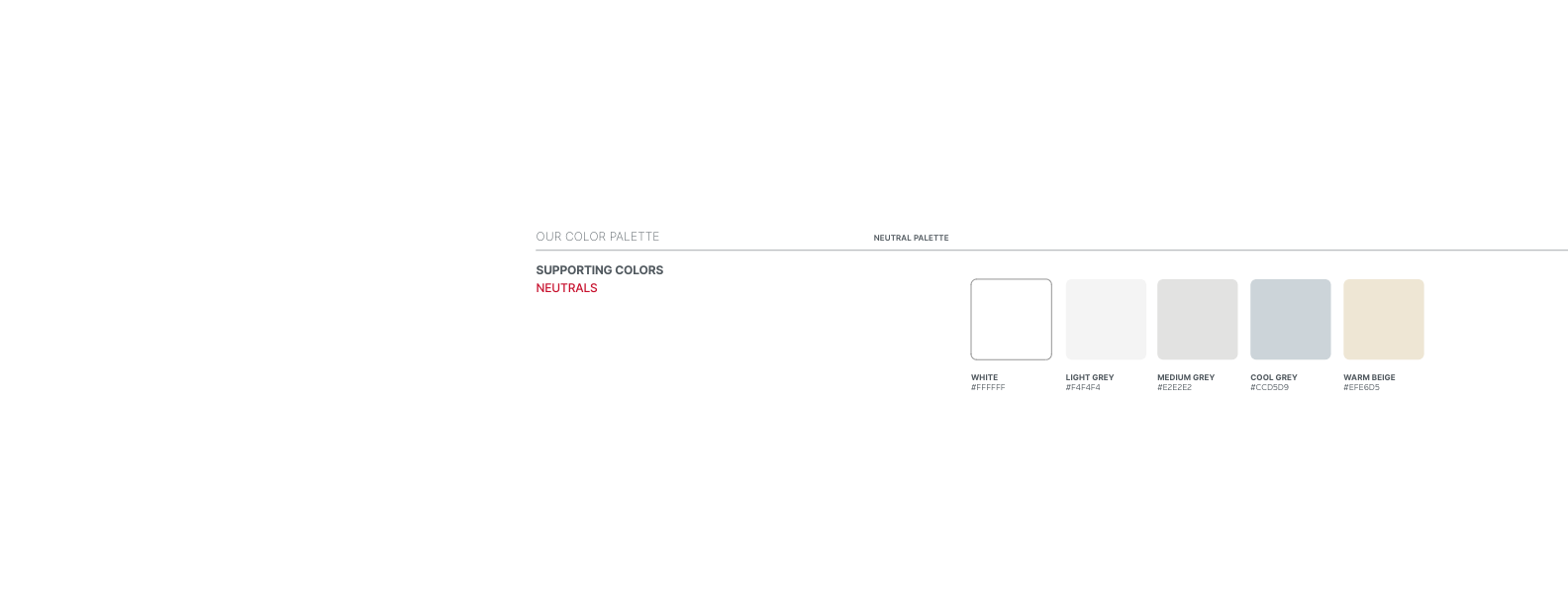
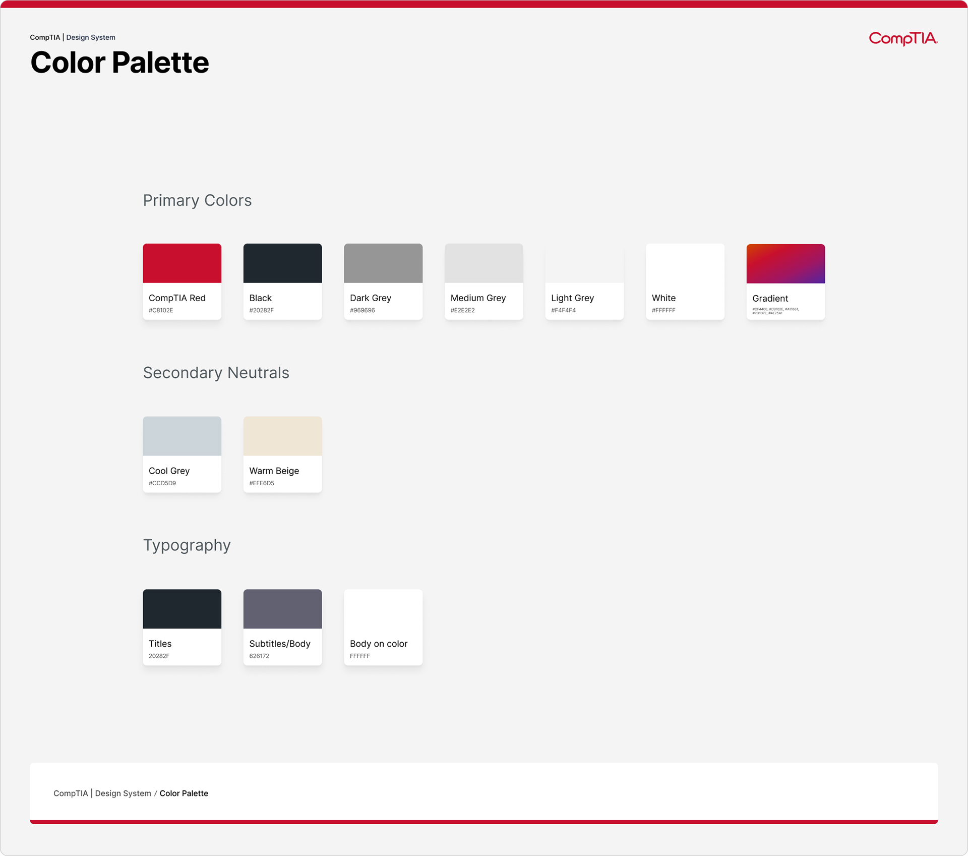
Unified Palette: Consolidated 30+ disparate colors into a focused Primary and Secondary system, ensuring high-contrast visibility.
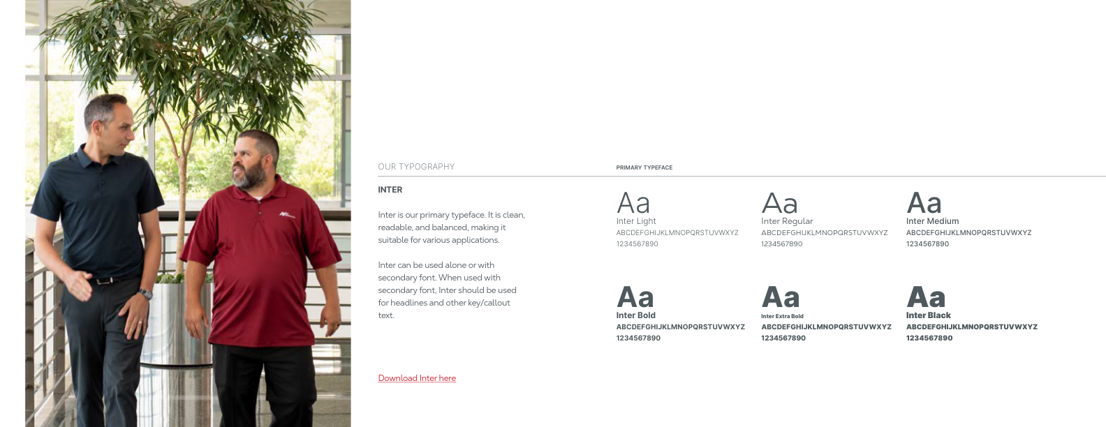
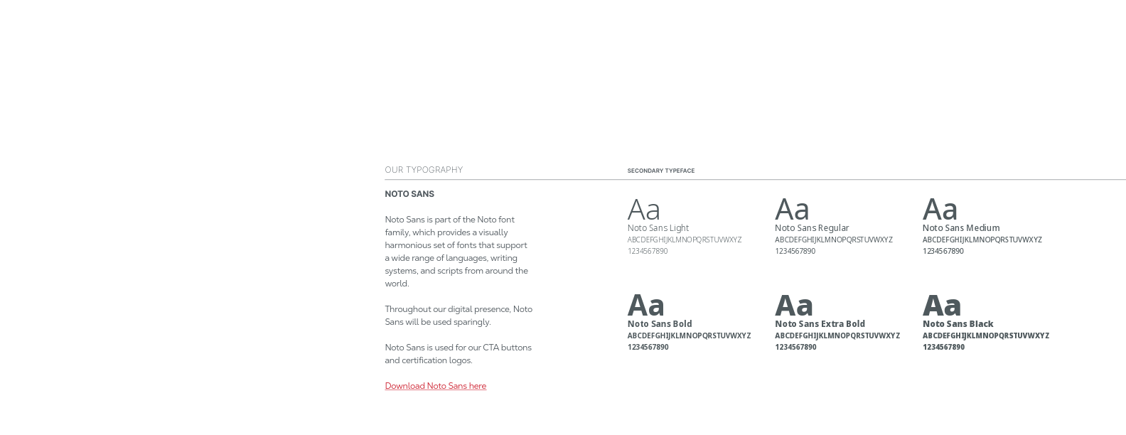
Typography: Standardized on the Inter font family for clean, accessible global communication across all digital and print channels.
Accessibility: Built the new system with WCAG compliance at the forefront to ensure inclusivity for all learners.
Brand Guidelines
Web Design System

The Digital Ecosystem
Scalable Digital Application
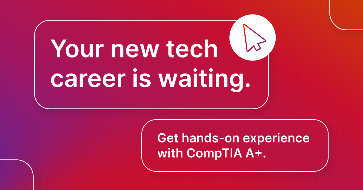
The new identity needed to be flexible enough to work across thousands of digital touchpoints without breaking. I designed modular templates for newsletters, social media, and webinars. This "kit of parts" approach allows marketing teams to produce high-volume content while maintaining 100% brand fidelity.
Information Architecture
Visualizing Complexity
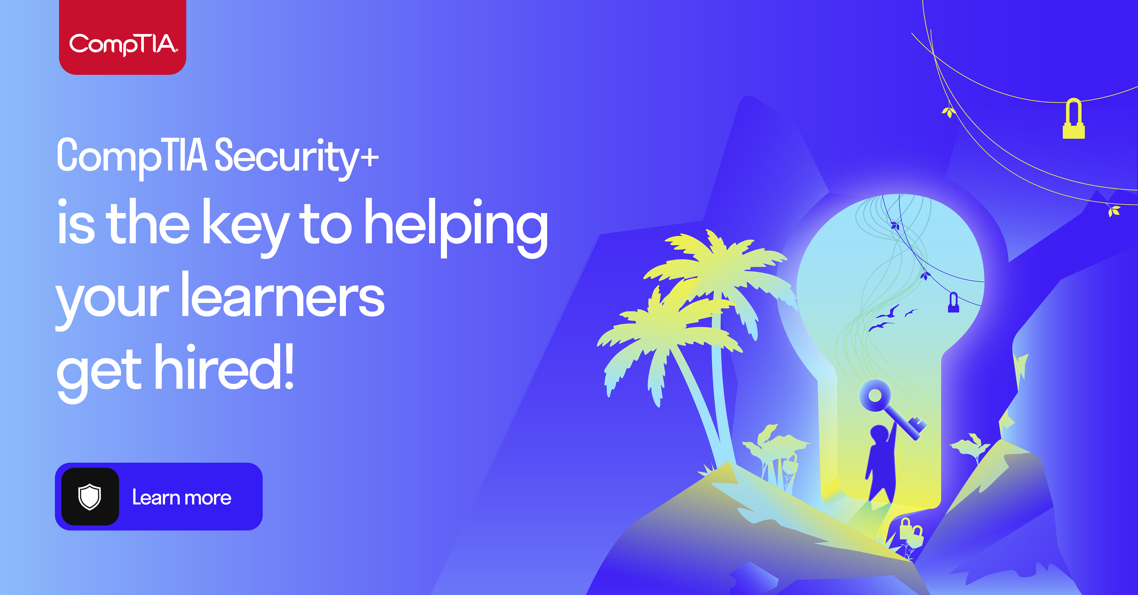
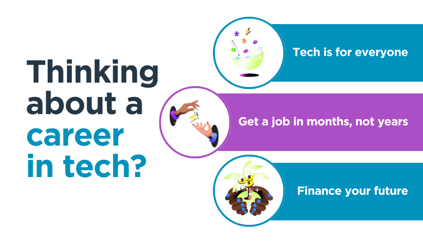
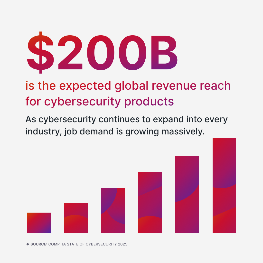
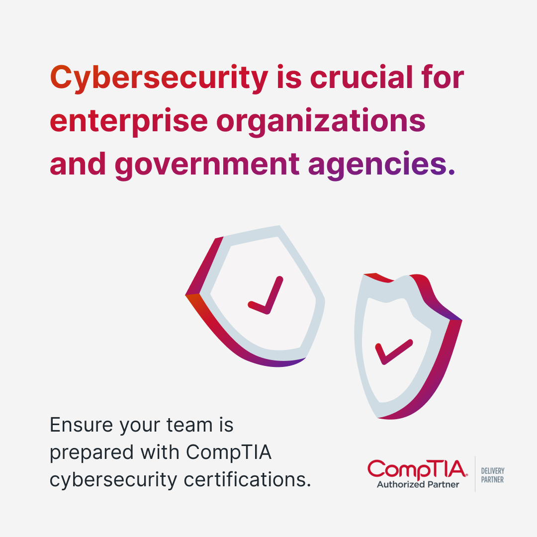
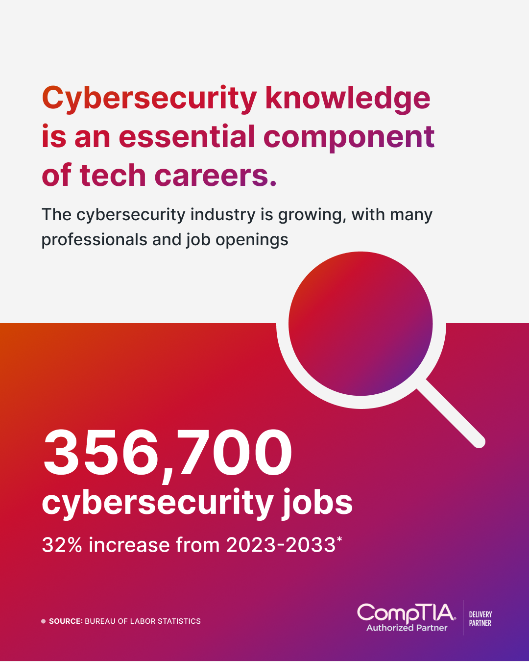
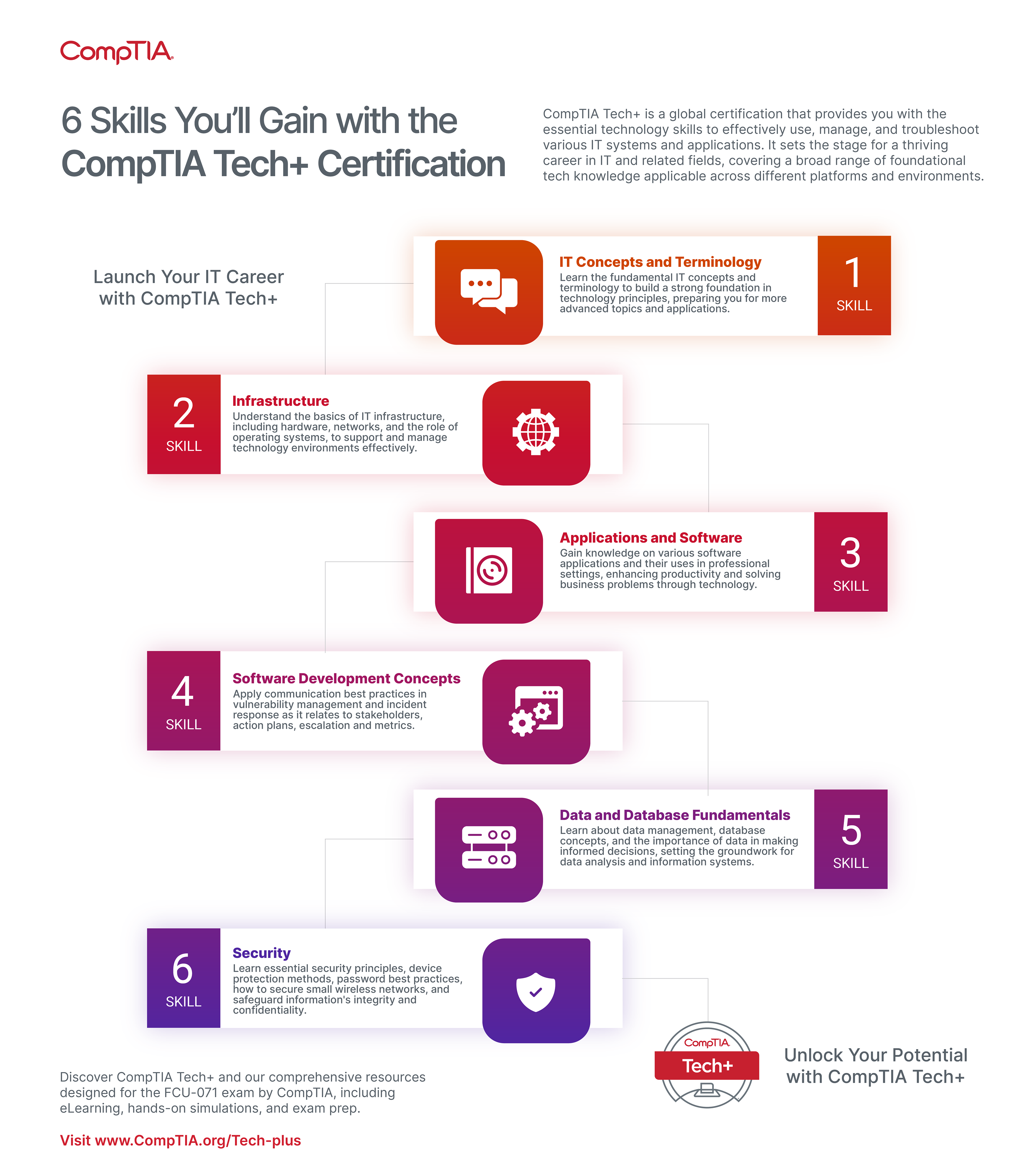
CompTIA communicates complex technical data. A key part of the rebrand was translating dense exam objectives into scannable, learner-centric visuals. I developed a visual language for infographics that guides the user’s eye through data without overwhelming them. The creative look makes cybersecurity accessible and contemporary.
The Physical World
Omnichannel Consistency
The identity scales seamlessly from mobile screens to physical trade show environments. The bold use of the primary red and deep violet creates an immediate visual anchor on a crowded expo floor, ensuring the brand is instantly recognizable from a distance.


Launch Strategy
Phase 1: Brand Identity & Strategy
Mission, Vision, and Values, Brand Persona/Voice, Brand Guidelines, Target Audience Personas
Phase 2: Visual Identity
Color Palette, Typography, Icon Library, Product Logos, Imagery, Design Kits
Phase 3: Marketing & Sales Collateral
Self-serve Templates, Business Cards, Slide Decks, Case Studies & Whitepapers, Brochures & Flyers
Phase 4: Digital Presence
Social Media & Email
Phase 5:
Website Launch
Impact & Outcomes
The Results
The rebrand empowered CompTIA with a unified dynamic identity, setting the stage for future growth.
Streamlined Communications: Guidelines now ensure every piece of communication, from digital ads to printed materials, conveys a unified professional message.
Contemporary Image: Positioned CompTIA as a forward-thinking leader, aligning the brand with contemporary design trends.
Stakeholder Confidence: The consistent branding has bolstered external trust and enhanced internal collaboration, supporting long-term strategic growth.